vue中自定义拖拽店铺布局
项目需求:
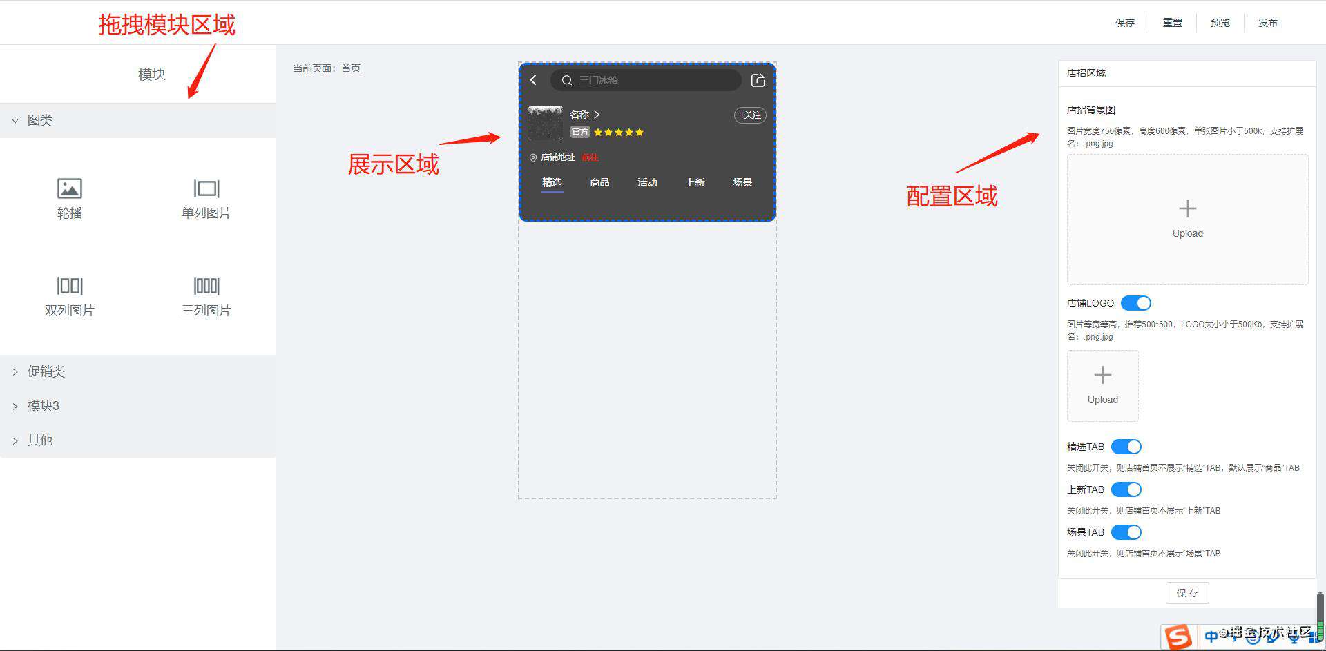
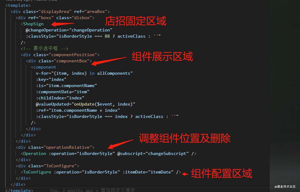
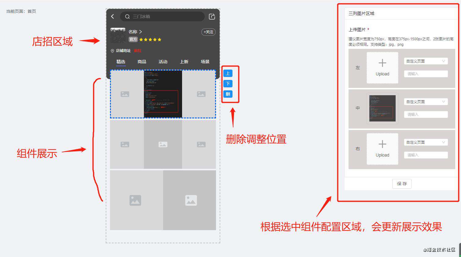
自定义拖拽店铺布局,从左侧拖拽组件到中间展示区域放下,展示区域生成组件,鼠标点击选中组件,右侧展示可配置区域,可对组件进行按钮操作上下移动和删除
布局:
代码:
实现:
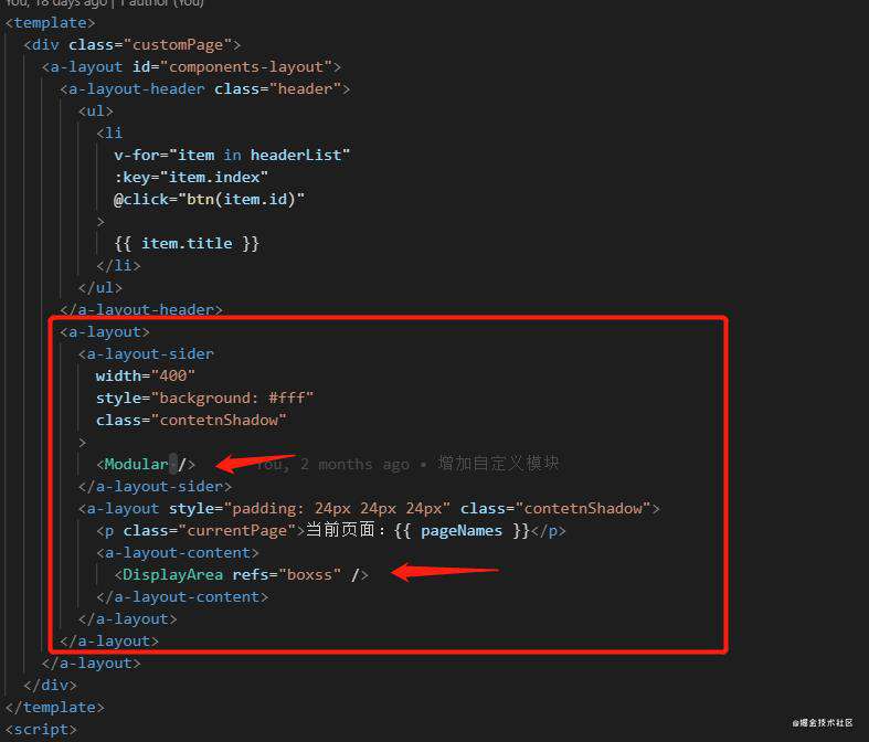
Modular组件作用
component 中的is如果不传不会展示该组件
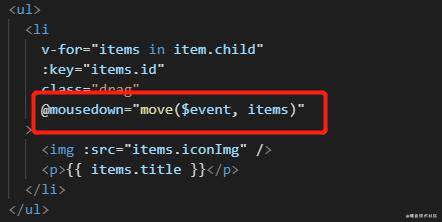
一、mousedown中干了什么?
- 1、算出鼠标点击,相对元素的位置
- 这地方用的网上找的代码,移动时候没有移动点击的元素,只是移动虚影
- 有不懂的可以百度下 vue中拖拽
- 2、拖拽虚影----重置并定位到按钮的中心位置
- 通过计算获取每个点击元素的位置,并且把虚影定位到点击的位置中,并阴影显示
let shadowDiv = this.$refs.shadowRef; shadowDiv.style.left =shadowDiv.offsetLeft -(shadowDiv.offsetWidth / 2 - odiv.offsetWidth / 2) +"px"; shadowDiv.style.top = shadowDiv.offsetTop -(shadowDiv.offsetHeight / 2 - odiv.offsetHeight / 2) +"px"; shadowDiv.style.zIndex = 1; - 3、获取vuex中所有数组中元素的高度
- 通过vuex获取现有展示区域中是否有数据,如果有数据会从新拼接数组
- childOffsetTop 距离顶部高度,200是默认店招本身加上padding的告诉,有布局原因
- childOffsetHeight 组件自身高度
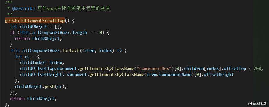
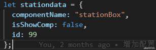
- 4、在每个组件中创建展示区阴影,如果vuex中没有数组就默认push阴影,更新vuex中数据
- 在点击事件中创建默认阴影方式重复触发
- componentName 阴影组件名字,如果为空vue中的component中is不会展示该组件
- isShowComp 是否展示阴影
// this.getChildElementScrollTop() 是获取vuex中所有元素高度的数组 let allScroll = this.getChildElementScrollTop(); // 在每个现有模块前面添加上阴影 allScroll.forEach((item, index) => { if (item.id !== 99) { this.componentParams.splice(index + index, 0, JSON.parse(JSON.stringify(stationdata)) ); } }); - 5、获取了滚动高度
// 取整滚动高度 Math.round(document.getElementsByClassName("contetnShadow")[1].scrollTop); - 6、更新vuex中数据
// 更新vuex中数据
this.$store.dispatch("changeAllComponents", this.componentParams);
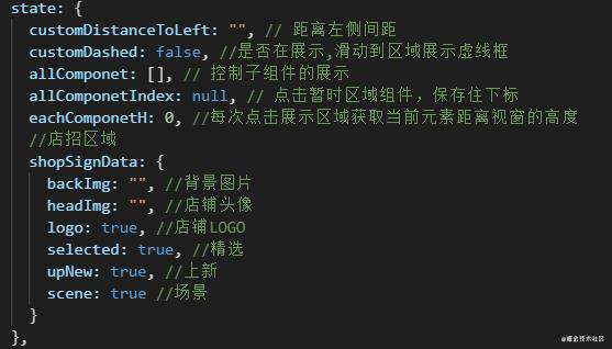
this.customDistanceToLefts 展示区域 距离左侧距离
- 7、获取展示区域距离左侧的距离
//this.customDistanceToLefts 展示区域 距离左侧距离
let newMoveLeft = this.customDistanceToLefts - 210;
二、onmousemove移动时干了什么?
-
1、e.preventDefault() 阻止默认动作,如果不阻止拖拽移动时候会卡住
-
2、控制拖拽阴影在移动期间宽、高增加,缩小和透明度
 // 控制移动阴影的大小,不带px单位的
  shadowDivLeft =left - (shadowDiv.offsetWidth / 2 - odiv.offsetWidth / 2);
  shadowDivtTop =top - (shadowDiv.offsetHeight / 2 - odiv.offsetHeight / 2);

  // 阴影移动真正的元素
  shadowDiv.style.left = shadowDivLeft + "px";
  shadowDiv.style.top = shadowDivtTop + "px";

  // 控制阴影在移动期间宽、高增加,缩小 限制阴影最大高度200
  if (shadowDivLeft <= 375 && shadowDivLeft >= 100) {
    shadowDiv.style.width = shadowDivLeft + "px";
    shoBoxContent = shadowDivLeft;
    if (shadowDivLeft <= 200) {
      shadowDiv.style.height = shadowDivLeft + "px";
    }
  }

  // 控制shadow的显示和隐藏
  // let left = e.clientX - disX;
  // shadowDivLeft就是上面的;
  this.showBox(left, shadowDivLeft);

  /**
   * @describe 修改透明度 宽度 高度
   */
  showBox(left, offsetLeft) {
    let shadowDiv = this.$refs.shadowRef;
    let newLeft = left - offsetLeft;
    if (newLeft > 1 && newLeft < 10) {
      shadowDiv.style.opacity = 0.1;
    } else if (newLeft >= 10 && newLeft < 20) {
      shadowDiv.style.opacity = 0.2;
    } else if (newLeft >= 20 && newLeft < 30) {
      shadowDiv.style.opacity = 0.3;
    } else if (newLeft >= 30 && newLeft < 40) {
      shadowDiv.style.opacity = 0.4;
    } else if (newLeft >= 40 && newLeft < 50) {
      shadowDiv.style.opacity = 0.5;
    } else if (newLeft >= 50 && newLeft < 60) {
      shadowDiv.style.opacity = 0.6;
    } else if (newLeft >= 60 && newLeft < 70) {
      shadowDiv.style.opacity = 0.65;
    } else if (newLeft >= 70 && newLeft < 80) {
      shadowDiv.style.opacity = 0.68;
    } else if (newLeft >= 80 && newLeft < 90) {
      shadowDiv.style.opacity = 0.7;
    } else if (newLeft >= 90 && newLeft < 100) {
      shadowDiv.style.opacity = 0.75;
    } else if (newLeft >= 100) {
      shadowDiv.style.opacity = 0.8;
    } else {
      shadowDiv.style.opacity = 0;
    }
  }
- 3、获取拖拽阴影是否进入到了展示区域,如果进入了就展示阴影
/**
 * @describe 增加展示区域虚框的提示,进入和离开
 * store中的changeCustomDashed函数控制显示隐藏,默认false
 */
showLeftContent = shadowDivLeft + shoBoxContent;
if (showLeftContent >= newMoveLeft && showLeftContent <= newMoveLeft + 375 * 2) {
  this.$store.dispatch("changeCustomDashed", true);
} else {
  this.$store.dispatch("changeCustomDashed", false);
}
- 4、核心,通过拖拽阴影+滚动高度,确定拖拽在哪个组件中,通过判断来显示该展示哪个阴影,通过修改componentName来展示
/**
 * @describe 计算位置区域
 * shadowDivtTop 距离顶部高度
 * shadowDiv.offsetHeight 阴影本身高度最大200
 * atop 拖拽高度和自身高度
 * 每一个组件top和height相加会有5px误差,可以保留,防止组件高度太小会同时展示上下2个阴影
 * this.okIndex 阴影的下标
 */
let atop = shadowDivtTop + shadowDiv.offsetHeight + contetnScrollTop;
if (allScroll.length === 0) {
  this.componentParams[0].isShowComp = true;
} else {
  allScroll.forEach((item, index) => {
    let zong = item.childOffsetTop + item.childOffsetHeight;
    if (atop >= item.childOffsetTop && atop <= zong) {
      this.okIndex = index;
      this.componentParams[index + index].isShowComp = true;
      if (this.chilidVal.title === "需求放在第一位") {
        this.okIndex = 0;
      } else {
        if (this.chilidVal.title === "需求放在最后一位") {
          this.okIndex = this.componentParams.length - 1;
        } else {
          this.okIndex = index;
        }
      }
    }
    if (index === allScroll.length - 1 && atop >= zong) {
      this.componentParams[
        this.componentParams.length - 1
      ].isShowComp = true;
      this.okIndex = this.componentParams.length - 1;
    }
  });
}
- 5、是否展示阴影
// isShowComp根据上面第4条中是否进入展示区域来判断
// 是否给阴影增加componentName,如果增加就会展示
this.componentParams.forEach(item => {
  if (item.id === 99) {
    if (item.isShowComp) {
      item.componentName = "stationBox";
    } else {
      item.componentName = "";
    }
  }
});
- 6、反选下标(demo中没有完善)
- 当在展示区域选中组件时,默认会在组件上包含一个虚影边框,告诉用户选中了哪一个。
- 从左侧拖拽组件到选中展示组件之上时index会发生变化,如果放下组件会默认选中刚放下这个组件,但是配置区域的功能没有更新
// 反选下标(部分代码思路不全)
  this.componentParams.forEach((item, index) => {
    if (item.title === names && storeModelId === item.storeModelId) {
      this.$store.dispatch("changeAllComponetIndex", index);
    }
  });
三、onmouseup鼠标离开时干了什么?
- 1、删除数组中所有的阴影
// 抬起鼠标时候先清空数组中所有的阴影部分
this.componentParams.forEach((item, index) => {
  if (item.id === 99) {
    this.componentParams.splice(index, 1);
  }
});
- 2、是否在展示区域离开,如果是就创造组件并更新vuex中的数组(demo中包含业务逻辑)
- 如果是在展示区域中松开才会执行插入组件,如果不是就不走这
- 3、重置样式
// 重置拖拽时候的虚影
shadowDiv.style.zIndex = -1;
shadowDiv.style.width = "100px";
shadowDiv.style.height = "100px";
document.onmousemove = null;
document.onmouseup = null;
// 隐藏边框显示
this.$store.dispatch("changeCustomDashed", false);
// 重置隐藏阴影
this.showBox(0, 0);
DisplayArea组件作用
一、展示区域
demo地址
常见问题FAQ
- 免费下载或者VIP会员专享资源能否直接商用?
- 本站所有资源版权均属于原作者所有,这里所提供资源均只能用于参考学习用,请勿直接商用。若由于商用引起版权纠纷,一切责任均由使用者承担。更多说明请参考 VIP介绍。
- 提示下载完但解压或打开不了?
- 找不到素材资源介绍文章里的示例图片?
- 模板不会安装或需要功能定制以及二次开发?


发表评论
还没有评论,快来抢沙发吧!