中英文混合
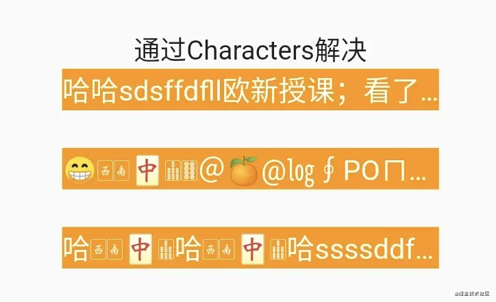
开发中意外发现中文字符后面如果跟随英文字符会出现字符显示不全的问题,而且这个问题还不是ellipsis所导致。突然觉得这是个天坑,看了issue发现目前这个问题还没有正式修复。
  String message1 = "哈哈sdsffdfll欧新授课;看了lllllkkkl";
  String message11 = "哈哈sdsffdflloojjjjjlllllkpppppppppppppkkl";
 开始自定义使用正则方式在中文字符后面添加\u{200B}不可见的0长度字符,但在一些特殊场景下也会导致字符显示不全的情况(比如字符串中存在emoji、特殊符号等)。
  String _toCharacters(String text) {
    // 若存在emoji则不适用会崩溃
     final exp = new RegExp('[\u4e00-\u9fa5]');
     text = text.replaceAllMapped(exp,
            (Match m) => "${m[0]}\u200B");
     text = text.codeUnits.getRange(0, text.length).toList().join("\u{200B}");
     text = text.replaceAll("", "\u{200B}");
    return text;
  }
最终解决方案:
依赖Characters对字符进行解码添加不可见0长度的字符实现字符不会被截断特殊字符和emoji都支持的文本显示。
  String _toCharacters(String text) {
    return Characters(text).toList().join("\u{200B}");
  }
暂时先解决了目前遇到的问题具体天坑原因以及是解决方案如何实现以后再做分析。
?参考代码点击这里查看?
- issue1
- issue2
- issue2
- characters
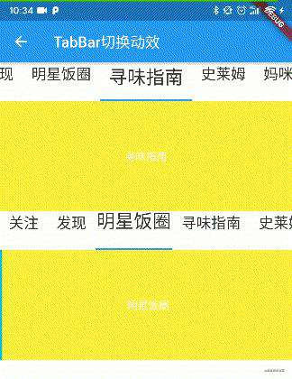
TabBar抖动问题
官方的TabBar也存在天坑,当为TabBar设置选择和未选择不同大小字体尺寸时滑动Tabbar字体大小动效变化有明显的抖动。这样不好的交互体验对于产品设计上是无法接受的,所以只能对字体变化动效做一些改变,通过修改源码中的_TabStyle增加Transform.scale组件将字体大小变化改变为缩放形式。(目前的效果只能作为过渡,可以做到字体缩放跟随平移达到和原动效才是关键。暂时还没有比较好的处理方式)
class _TabStyle extends AnimatedWidget {
  const _TabStyle({
    Key key,
    Animation<double> animation,
    this.selected,
    this.labelColor,
    this.unselectedLabelColor,
    this.labelStyle,
    this.unselectedLabelStyle,
    @required this.child,
  }) : super(key: key, listenable: animation);

  final TextStyle labelStyle;
  final TextStyle unselectedLabelStyle;
  final bool selected;
  final Color labelColor;
  final Color unselectedLabelColor;
  final Widget child;

  @override
  Widget build(BuildContext context) {
    final ThemeData themeData = Theme.of(context);
    final TabBarTheme tabBarTheme = TabBarTheme.of(context);
    final Animation<double> animation = listenable as Animation<double>;

    // To enable TextStyle.lerp(style1, style2, value), both styles must have
    // the same value of inherit. Force that to be inherit=true here.
//    final TextStyle defaultStyle = (labelStyle
//        ?? tabBarTheme.labelStyle
//        ?? themeData.primaryTextTheme.bodyText1
//    ).copyWith(inherit: true);
//    final TextStyle defaultUnselectedStyle = (unselectedLabelStyle
//        ?? tabBarTheme.unselectedLabelStyle
//        ?? labelStyle
//        ?? themeData.primaryTextTheme.bodyText1
//    ).copyWith(inherit: true);
//    final TextStyle textStyle = selected
//        ? TextStyle.lerp(defaultStyle, defaultUnselectedStyle, animation.value)
//        : TextStyle.lerp(defaultUnselectedStyle, defaultStyle, animation.value);


    final TextStyle defaultUnselectedStyle = (unselectedLabelStyle ??
            tabBarTheme.unselectedLabelStyle ??
            labelStyle ??
            themeData.primaryTextTheme.bodyText1)
        .copyWith(inherit: true);
    final TextStyle defaultStyle = (labelStyle ??
            tabBarTheme.labelStyle ??
            themeData.primaryTextTheme.bodyText1)
        .copyWith(inherit: true)
        .copyWith(fontSize: defaultUnselectedStyle.fontSize);
    final TextStyle textStyle = selected
        ? TextStyle.lerp(defaultStyle, defaultUnselectedStyle, animation.value)
        : TextStyle.lerp(defaultUnselectedStyle, defaultStyle, animation.value);

    final Color selectedColor = labelColor
        ?? tabBarTheme.labelColor
        ?? themeData.primaryTextTheme.bodyText1.color;
    final Color unselectedColor = unselectedLabelColor
        ?? tabBarTheme.unselectedLabelColor
        ?? selectedColor.withAlpha(0xB2); // 70% alpha
    final Color color = selected
        ? Color.lerp(selectedColor, unselectedColor, animation.value)
        : Color.lerp(unselectedColor, selectedColor, animation.value);


    final double multiple = labelStyle.fontSize / unselectedLabelStyle.fontSize;
    final double _scale = selected
        ? lerpDouble(multiple, 1, animation.value)
        : lerpDouble(1, multiple, animation.value);


    return DefaultTextStyle(
      style: textStyle.copyWith(color: color),
      child: IconTheme.merge(
        data: IconThemeData(
          size: 24.0,
          color: color,
        ),
        // 使用缩放代替动画绘制
        child: Transform.scale(
          scale: _scale,
          child: child,
        ),
      ),
    );
  }
}
- issue
- 从源码分析TabBar的文字抖动问题
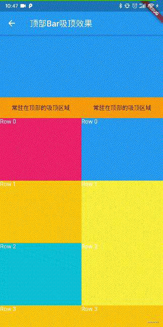
AppBar吸顶
在开发中发现布局是NestedScrollView + CustomScrollView情况下SliverAppBar的floating=true和pinned=true时AppBar只能在列表滑动的顶部时才能展开。当只有CustomScrollView的情况下AppBar可以在列表做下滑操作时就能展开。
return Row(
      children: <Widget>[
      	/// 第一种情况NestedScrollView + CustomScrollView
        Expanded(
          child: NestedScrollView(
            headerSliverBuilder: (BuildContext context, bool boxIsScrolled) {
              return <Widget>[
                SliverAppBar(
                  leading: Container(),
                  expandedHeight: 200.0,
                  title: Text(""),
                  floating: true,
                  pinned: true,
                  flexibleSpace: FlexibleSpaceBar(
                    collapseMode: CollapseMode.pin,
                  ),
                  bottom: PreferredSize(
                    child: Container(
                      alignment: Alignment.center,
                      height: 50,
                      width: MediaQuery.of(context).size.width,
                      color: Colors.orange,
                      child: Text("常驻在顶部的吸顶区域"),
                    ),
                    preferredSize: Size.fromHeight(50),
                  ),
                ),
              ];
            },
            body: CustomScrollView(
              slivers: [
                SliverList(
                  delegate: SliverChildBuilderDelegate(
                    (context, index) {
                      Color color = getRandomColor();
                      return Container(
                        height: 150.0,
                        color: color,
                        child: Text(
                          "Row $index",
                          style: TextStyle(
                            color: Colors.white,
                          ),
                        ),
                      );
                    },
                  ),
                ),
              ],
            ),
          ),
        ),
        /// 第二种情况只有CustomScrollView
        Expanded(
          child: CustomScrollView(
            slivers: [
              SliverAppBar(
                leading: Container(),
                expandedHeight: 200.0,
                title: Text(""),
                floating: true,
                pinned: true,
                flexibleSpace: FlexibleSpaceBar(
                  collapseMode: CollapseMode.pin,
                ),
                bottom: PreferredSize(
                  child: Container(
                    alignment: Alignment.center,
                    height: 50,
                    width: MediaQuery.of(context).size.width,
                    color: Colors.orange,
                    child: Text("常驻在顶部的吸顶区域"),
                  ),
                  preferredSize: Size.fromHeight(50),
                ),
              ),
              SliverList(
                delegate: SliverChildBuilderDelegate(
                  (context, index) {
                    Color color = getRandomColor();
                    return Container(
                      height: 150.0,
                      color: color,
                      child: Text(
                        "Row $index",
                        style: TextStyle(
                          color: Colors.white,
                        ),
                      ),
                    );
                  },
                ),
              ),
            ],
          ),
        ),
      ],
    );
所以在采用NestedScrollView + CustomScrollView的布局样式并且Body是TabBar+TabView若希望TabView列表内容上滑预览一段后希望上拉马上出现AppBar,这样的需求并不好直接实现。主要因为NestedScrollView和CustomScrollView都属于滑动组件,在滑动优先级上NestedScrollView会先执行CustomScrollView内部滑动当CustomScrollView滑动到顶部后再滑动NestedScrollView。可以通过为NestedScrollView设置GlobalKey的key在NestedScrollViewState中获取到innerController和outerController,分别代表NestedScrollView内部滑动和外部滑动。
目前已知解决Body中CustomerScrollView滑动带动NestedScrollView中AppBar联动展开通过设置两个ScrollController分别监听NestedScrollView和CustomScrollView滑动,然后通过NotificationListener获取ScrollController偏移量来设置NestedScrollView滚动值。
?Demo代码看这里?
Webp格式Gif图片播放有残影问题
使用Image组件又遇到一个深坑,在加载图片资源时发现gif播放会有残影的情况,最后一帧图像上会有上一帧内容显示。开始以为是制作出的gif问题,但asset形式加载没有问题更换为网络地址加载又有残影。后来发现原先图片加载库对图片地址做了处理,CDN会在加载路径上加上webp导致图片加载格式为webp。(也难怪通过自定义图片加载库和Flutter原生图片加载库返回的byte大小不一样,因为自定义的自动更新为webp加载资源更小)

然后获取转为webp的图片地址下载资源,发现确实是webp格式。接着重新以asset加载webp图片文件,发现确实存在残影问题,最终怀疑是Flutter的图片加载就存在这个bug。翻翻官方issue,确实如此!!此处耗费半天时间排查问题,绝对是一个大坑!!Flutter底层问题暂时也没有特别好的解决方案,先使用普通格式gif加载,对于小尺寸图片问题不大。
?bugDemo可以看这里?
官方issue
文本和Icon同行布局
在开发中常见布局一行文本加一个标签,当文本字数超出时显示省略号。
1.如下所示布局当Text过长时会有警告⚠️同时Icon会被挤出布局
Row(
  children: <Widget>[
    Text(
     "我是长文本。。。。。。。。。。。",
     overflow: TextOverflow.ellipsis,
     maxLines: 1,
    ),
    Icon(Icons.add),
  ],
)
2.通过Expanded组件增加约束,但Text默认会占用所有剩余空间,Icon会被挤到布局最右边。
Row(
  children: <Widget>[
    Expanded(
      child: Text(
        "我是长文本。。。。。。。。。。。",
        overflow: TextOverflow.ellipsis,
        maxLines: 1,
      ),
    ),
    Icon(Icons.add),
  ],
),
3.采用Flexible解决Text默认不占用所有剩余空间,Icon也能紧靠在Text文本之后。
Row(
  children: <Widget>[
    Flexible(
      child: Text(
        "我是长文本。。。。。。。。。。。",
        overflow: TextOverflow.ellipsis,
        maxLines: 1,
      ),
    ),
    Icon(Icons.add),
  ],
),
然后从源码上看可以发现Expanded继承Flexible,不同的是Flexible的fit是FlexFit.loose,Expanded的fit是FlexFit.tight。因此知道缘由FlexFit.tight占用所有空间,FlexFit.loose默认非占用所有空间。所以在由依靠关系可以使用Flexible避免默认就占用所有空间。
class Expanded extends Flexible {
  /// Creates a widget that expands a child of a [Row], [Column], or [Flex]
  /// so that the child fills the available space along the flex widget's
  /// main axis.
  const Expanded({
    Key key,
    int flex = 1,
    @required Widget child,
  }) : super(key: key, flex: flex, fit: FlexFit.tight, child: child);
}

const Flexible({
  Key key,
  this.flex = 1,
  this.fit = FlexFit.loose,
  @required Widget child,
}) : super(key: key, child: child);
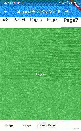
TabBar动态添加和动态定位问题
在使用TabBar过程中也遇到一个坑,开发需求中需要对TabBar做增删操作同时编辑完后需要定位到指定位置。在删除位置上没有问题,TabBar下标和TabBarView显示都正常。但是添加TabBar操作就存在问题,当添加一个新TabBar并定位到新增TabBar时下标正常,但TabBarView显示的不是当前页面。当滑动TabBarView就会导致TabBar下标回到当前页面下标与当前TabBarView同步。可知动态添加TabBar和更新TabController实时上并没有同步到TabBarView,导致滑动刷新时下标又回到了与TabBarView同步的位置。
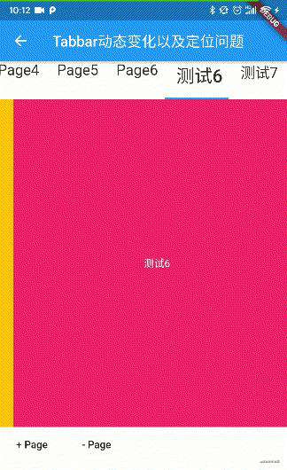
一个简单的解决方法是延迟定位到指定页面,在数据更新后延迟定位指定下标
tabs.add("测试${tabs.length}");
_initDates();
tabController = TabController(
  initialIndex: 0,
  length: tabs.length,
  vsync: this,
);
setState(() {
});
Future.delayed(Duration(seconds: 1),(){
  tabController.animateTo(tabs.length - 1);
});
另外也可以改写TabBarView源码做到根据TabBar的下标变化同步当前显示的页面,具体操作这里就不展开说了,只要知道是因为TabController变化没有及时通知到TabBarView就能够根据问题找具体解决办法。
?实例代码看这里?
赛贝尔曲线绘制圆锯齿问题
在使用lottie库的时候发现json动效文件若有绘制圆形时在iOS平台上会出现锯齿问题,但这个情况并没有在Android平台上出现,也就是说只有在iOS上会出现绘制圆形会有锯齿的情况。在阅读lottie源码过程中发现,在lottie库中绘制圆形是采用赛贝尔曲线也正是使用path线条绘制弧形,没有使用canvas的circle接口。目前未知具体导致的原因,个人暂时解决方案就是在iOS平台若有圆形绘制还是采用circle接口来避免出现锯齿问题,虽然采取的方案low但很有用。
//修改fill_content.dart的draw方法,注释绘制path方法,若是iOS平台并且是绘制圆的情况采用circle绘制。
// canvas.drawPath(_path, _paint);
if(Platform.isIOS){
  if(hasCircle){
    var rect = _path.getBounds();
    canvas.drawCircle(rect.center,rect.width / 2,_paint);
  }else{
    canvas.drawPath(_path, _paint);
  }
}else{
  canvas.drawPath(_path, _paint);
}
Lottie的issue
ListView使用有话说
在做应用优化的时候发现,一个ListView列表当时使用了initialScrollOffset初始化定位到指定位置。通过日志发现itemBuilder确实从下标为0开始build到指定平移量的下标Cell。难道初始化过程中从第一个Cell创建到指定下标位置为止吗?
看了ListView的入参配置发现两个参数cacheExtent和itemExtent,分别表示缓存的大小和单个cell大小。如下所示itemExtent设置为500,cacheExtent设置为500 * 5.0则会缓存差不多5个cell对象,也就是初始化时会缓存初始化下标左右一共5个对象,若不需要缓存cacheExtent设置为0。但itemExtent和cacheExtent只能搭配使用在itemExtent未知情况下,初始化还是会从下标0初始化到initialScrollOffset指定值为止。
但若ListView每个Cell宽度或高度不同itemExtent和cacheExtent是不是就不适用了?目前实战中确实遇到这样的困惑,初始化时还是会从下标0开始build。
 Container(
   height: 200,
   child: ListView.builder(
     scrollDirection: Axis.horizontal,
     itemBuilder: (context, index) {
       return _cellItem("<ListJumpInitDemo> ListView", index);
     },
     itemCount: 50,
     controller: scrollController,
     cacheExtent: 500 * 5.0,
     itemExtent: 500,
   ),
 ),
?测试代码看这里?
常见问题FAQ
- 免费下载或者VIP会员专享资源能否直接商用?
- 本站所有资源版权均属于原作者所有,这里所提供资源均只能用于参考学习用,请勿直接商用。若由于商用引起版权纠纷,一切责任均由使用者承担。更多说明请参考 VIP介绍。
- 提示下载完但解压或打开不了?
- 找不到素材资源介绍文章里的示例图片?
- 模板不会安装或需要功能定制以及二次开发?


发表评论
还没有评论,快来抢沙发吧!