1、Y坐标文字过长被遮挡
grid: {
    left: 0,   // 与容器左侧的距离
    right: 0, // 与容器右侧的距离
    bottom: "3%",
    top: "0"
    containLabel: true // grid 区域是否包含坐标轴的刻度标签
}
2、X轴标签过长,展示不全
xAxis: {
  axisLabel: {
    color: "#5e6877", // x轴字体颜色
    interval: 0, // 0 强制显示所有标签,默认auto
    rotate: 20 // 刻度标签旋转的角度
  }
}

// 省略号表示
xAxis: {
  axisLabel: {
	    formatter: function (value) {
	        if (value.length > 6) {
	            return value.substring(0, 6) + "...";
	        } else {
	            return value;
	        }
	    }
	}
}
3、legend图例内容过长,与图表发生重叠
legend: {
  type: 'scroll', // 可滚动翻页的图例,当图例数量较多时可以使用
  orient: 'vertical',
  textStyle: {
      lineHeight: 20
  },
  formatter: function(sStr) { // 需要配合textStyle.lineHeight设置行高,不然换行后行间距太小
      var str = "";
      var l = 0;
      var schar;
      for (var i = 0; schar = sStr.charAt(i); i++) {
          str += schar;
          // /[^\x00-\xff]/ 匹配双字节字符,如中文、全角符号,其它单字节字符如字母、数字、半角符号
          l += schar.match(/[^\x00-\xff]/) ? 2 : 1;
          if (l > 10) {
              // 只有原字符串内容长度大于需要换行的长度临界点,才需要换行
              str += (sStr.length > str.length) ? '\n' : '';
              l = 0;
          }
      }
      return str;
  }
}
4、tooltip显示内容较多时,超出屏幕,显示不全
tooltip: {
    confine: true // 是否将 tooltip 框限制在图表区域内
}
5、折线图整体数据值偏大,显示范围幅度不明显
yAxis: {
    type: 'value',
    scale: true // 按比例显示
}
6、移动端柱形图内容较多,配置屏幕旋转
.horizontalScreen {
    transform: rotate(90deg);
    transform-origin: bottom left;
    position: absolute;
    top: -100vw;
    height: 100vw;
    width: 100vh;
    background-color:#FFF;
    z-index: 100;
}
7、柱形图默认宽度自适应,导致多条数据与单条数据宽度显示不一致
series: [
  {
  	type: 'line',
    barMaxWidth: 30 // 可以是绝对值例如 40 或者百分数例如 '60%',百分数基于自动计算出的每一类目的宽度。
  }
]
8、echarts图表响应式缩放
window.addEventListener('resize', () => {
    myChart.resize();
    // myChart2.resize();
    // myChart3.resize();
})
9、echarts图表内容过多,一屏或者容器显示不下
dataZoom: [
  {
    show: true,
    startValue:  startOffset, // 数据窗口范围的起始数值
    endValue: endOffset // 数据窗口范围的结束数值
  },
  {
    type: 'inside'
  }
]
10、legend设置单选
legend: {
    data:[],
    selectedMode: 'single',
}
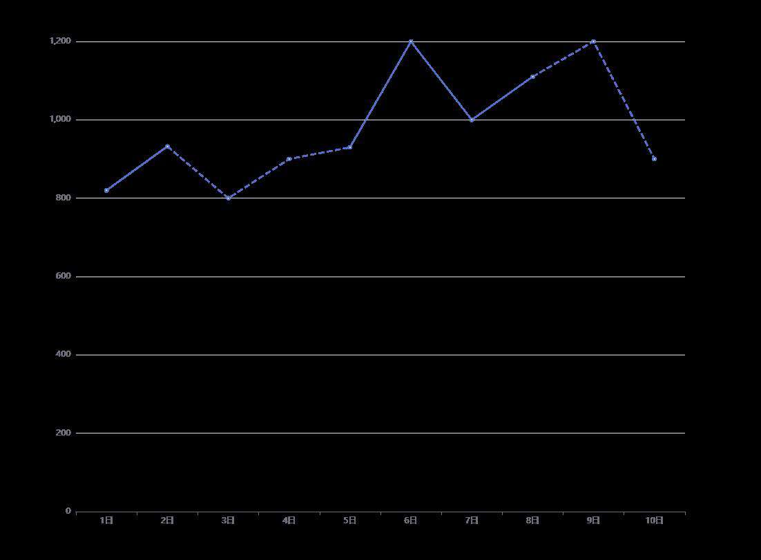
11、实现折线图局部虚线
option = {
  xAxis: {
    type: 'category',
    data: ['1日', '2日', '3日', '4日', '5日', '6日', '7日', '8日', '9日', '10日']
  },
  yAxis: {
    type: 'value'
  },
  series: [{
    name: '产量',
    data: [820, 932, '', '', 930, 1200, 1000, 1110, '', ''],
    type: 'line',
    itemStyle: {
      normal: {
        lineStyle: {
          width: 2
        }
      }
    }
  },
  {
    name: '产量',
    data: ['', 932, 800, 900, 930, '', '', 1110, 1200, 900],
    type: 'line',
    itemStyle: {
      normal: {
        lineStyle: {
          width: 2,
          type: 'dashed'
        }
      }
    }
  }
  ]
};
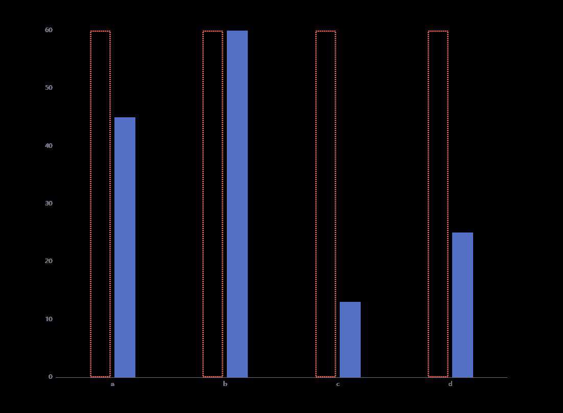
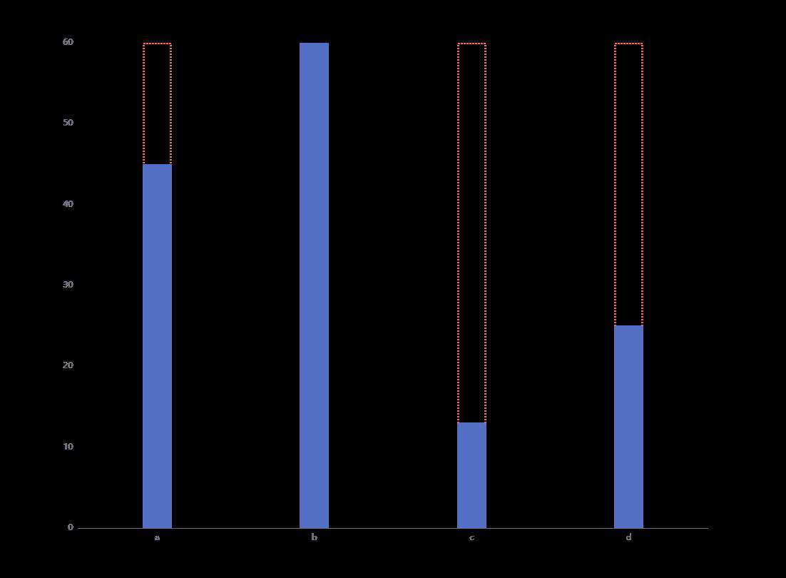
12、柱状图实现重合并且以虚线展示
option = {
  xAxis: {
    data: ['a', 'b', 'c', 'd'],
    axisTick: { show: false }
  },
  yAxis: {
    splitLine: { show: false }
  },
  animationDurationUpdate: 1200,
  series: [{
    type: 'bar',
    itemStyle: {
      normal: {
        color: 'transparent',
        barBorderColor: 'tomato',
        barBorderWidth: 2,
        barBorderRadius: 0,
        borderType: "dotted"
      }
    },
    silent: true,
    barWidth: 40,
    barGap: '-100%', // 柱子重叠
    data: [60, 60, 60, 60]
  }, {
    type: 'bar',
    barWidth: 40,
    z: 10,
    data: [45, 60, 13, 25]
  }]
};
不设置 barGap 时是这样的:
 设置
设置 barGap 为 -100% 后:
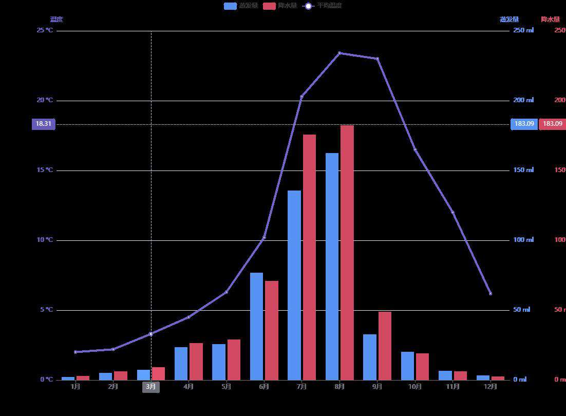
13、实现多Y轴展示
// 通过多Y轴,来实现多个维度对比来看数据的变化
var colors = ['#5793f3', '#d14a61', '#675bba'];
option = {
  color: colors,
  tooltip: {
    trigger: 'axis',
    axisPointer: {
      type: 'cross'
    }
  },
  legend: {
    data: ['蒸发量', '降水量', '平均温度']
  },
  xAxis: [
    {
      type: 'category',
      axisTick: {
        alignWithLabel: true
      },
      data: ['1月', '2月', '3月', '4月', '5月', '6月', '7月', '8月', '9月', '10月', '11月', '12月']
    }
  ],
  yAxis: [
    {
      type: 'value',
      name: '蒸发量',
      min: 0,
      max: 250,
      position: 'right',
      axisLine: {
        lineStyle: {
          color: colors[0]
        }
      },
      axisLabel: {
        formatter: '{value} ml'
      }
    },
    {
      type: 'value',
      name: '降水量',
      min: 0,
      max: 250,
      position: 'right',
      offset: 80,
      axisLine: {
        lineStyle: {
          color: colors[1]
        }
      },
      axisLabel: {
        formatter: '{value} ml'
      }
    },
    {
      type: 'value',
      name: '温度',
      min: 0,
      max: 25,
      position: 'left',
      axisLine: {
        lineStyle: {
          color: colors[2]
        }
      },
      axisLabel: {
        formatter: '{value} °C'
      }
    }
  ],
  series: [
    {
      name: '蒸发量',
      type: 'bar',
      data: [2.0, 4.9, 7.0, 23.2, 25.6, 76.7, 135.6, 162.2, 32.6, 20.0, 6.4, 3.3]
    },
    {
      name: '降水量',
      type: 'bar',
      yAxisIndex: 1,
      data: [2.6, 5.9, 9.0, 26.4, 28.7, 70.7, 175.6, 182.2, 48.7, 18.8, 6.0, 2.3]
    },
    {
      name: '平均温度',
      type: 'line',
      yAxisIndex: 2,
      data: [2.0, 2.2, 3.3, 4.5, 6.3, 10.2, 20.3, 23.4, 23.0, 16.5, 12.0, 6.2]
    }
  ]
};
 会继续更新中,敬请期待。
常见问题FAQ
- 免费下载或者VIP会员专享资源能否直接商用?
- 本站所有资源版权均属于原作者所有,这里所提供资源均只能用于参考学习用,请勿直接商用。若由于商用引起版权纠纷,一切责任均由使用者承担。更多说明请参考 VIP介绍。
- 提示下载完但解压或打开不了?
- 找不到素材资源介绍文章里的示例图片?
- 模板不会安装或需要功能定制以及二次开发?


发表评论
还没有评论,快来抢沙发吧!