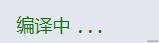
1、点点点加载
<div class="dot">...</div>
@supports (display: none) {
    div.dot {
      display: inline-block;
      width: 3ch;
      text-indent: -1ch;
      vertical-align: bottom;
      overflow: hidden;
      animation: dot 3s infinite step-start both;
      font-family: Consolas, Monaco, monospace;
    }
  }

  @keyframes dot {
    33% {
      text-indent: 0;
    }
    66% {
      text-indent: -2ch;
    }
  }
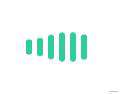
2、条形加载条
<ul class="strip-loading">
    <li style="--line-index: 1;"></li>
    <li style="--line-index: 2;"></li>
    <li style="--line-index: 3;"></li>
    <li style="--line-index: 4;"></li>
    <li style="--line-index: 5;"></li>
    <li style="--line-index: 6;"></li>
</ul>
.strip-loading {
    display: flex;
    justify-content: center;
    align-items: center;
    width: 200px;
    height: 200px;

}

.strip-loading li {
    --time: calc((var(--line-index) - 1) * 200ms);
    border-radius: 3px;
    width: 6px;
    height: 30px;
    background-color: #33cc99;
    animation: beat 1.5s ease-in-out var(--time) infinite;
    list-style-type: none;
}

li + li {
    margin-left: 5px;
}
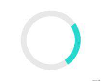
3、圆环加载
<div class="rotate-animate"></div>
.rotate-animate {
    border:12px solid #e8e8e8;
    border-radius:50%;
    border-top:12px solid #28d8cf;
    width:100px;
    height:100px;
    animation:rotate 2s linear infinite;
}

@keyframes rotate{
    0%{
        transform: rotate(0deg);
    }
    100%{
        transform:rotate(360deg);
    }
}
4、圆圈扩散加载

<div class="loader">
        <div></div>
</div>
@supports (display: none) {
    .loader {
  display: grid;
  grid-template-columns: 1fr 1fr 1fr;
  grid-gap: 8px;
}
.loader div {
  width: 60px;
  height: 60px;
  position: relative;
  display: flex;
  justify-content: center;
  align-items: center;
  background-color: #66cdaa;
  border-radius: 50%;
}
.loader div:before,
.loader div:after {
  content: '';
  width: 60px;
  height: 60px;
  position: absolute;
  border-radius: 50%;
}
.loader div:before {
  background-color: #ffdab9;
  animation: scale-1 2400ms linear infinite;
}
.loader div:after {
  background-color: #66cdaa;
  animation: scale-2 2400ms linear infinite;
}

@keyframes scale-1 {
  0% {
    transform: scale(0);
    z-index: 2;
  }
  50%, 100% {
    transform: scale(1);
  }
}
@keyframes scale-2 {
  0%, 50% {
    transform: scale(0);
  }
  100% {
    transform: scale(1);
  }
}
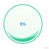
5、悬浮球进度加载
<div id="ball" class="state-ball" style="--offset: 0;">
     <div class="wave"></div>
     <div class="progress"></div>
</div>
.state-ball {
    overflow: hidden;
    position: relative;
    padding: 5px;
    border: 3px solid #3c9;
    border-radius: 100%;
    width: 150px;
    height: 150px;
    background-color: #fff;
}
.state-ball::before,.state-ball::after{
    position: absolute;
    left: 50%;
    bottom: 5px;
    z-index: 9;
    margin-left: -100px;
    width: 200px;
    height: 200px;
    content: "";
}
.state-ball::before{
    margin-bottom: calc(var(--offset) * 1.5px);
    border-radius: 45%;
    background-color: #ffffff80;
    animation: rotate 10s linear -5s infinite;
}
.state-ball::after {
    margin-bottom: calc(var(--offset) * 1.5px + 10px);
    border-radius: 40%;
    background-color: #fffc;
    animation: rotate 15s infinite;
}
.state-ball .wave{
    position: relative;
    border-radius: 100%;
    width: 100%;
    height: 100%;
    background-image: linear-gradient(to bottom, #af8 13%, #3c9 91%);
}
.state-ball .progress::after{
    display: flex;
    position: absolute;
    left: 0;
    top: 0;
    z-index: 99;
    justify-content: center;
    align-items: center;
    width: 100%;
    height: 100%;
    font-weight: bold;
    font-size: 16px;
    color: #09f;
    content: counter(progress) "%";
    counter-reset: progress var(--offset);
}

@keyframes rotate {
    to {
        transform: rotate(1turn);
    }
}
//js控制进度
let offset = 0;
let interval = null;
interval = setInterval(() => {
    document.getElementById('ball').style.setProperty("--offset", offset);
    if (offset < 100) {
        offset++;
    } else {
        clearInterval(interval);
    }

}, 200);
6、楼梯循环加载
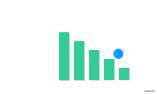
<div class="loader">
        <div class="loader__bar" style="--line-index: 1;"></div>
        <div class="loader__bar" style="--line-index: 2;"></div>
        <div class="loader__bar" style="--line-index: 3;"></div>
        <div class="loader__bar" style="--line-index: 4;"></div>
        <div class="loader__bar" style="--line-index: 5;"></div>
        <div class="loader__ball"></div>
 </div>
.loader {
  position: relative;
}

.loader__bar{
    position: absolute;
    bottom: 0;
    left: calc((var(--line-index) - 1) * 15px);
    width: 10px;
    height: 50px;
    background:  #33cc99;
    transform-origin: center bottom;
    box-shadow: 1px 1px 0 rgba(0,0,0,.2);
    animation: bar 4s infinite;
}

.loader__ball {
    position: absolute;
    bottom: 10px;
    left: 0;
    width: 10px;
    height: 10px;
    background: #09f;
    border-radius: 50%;
    animation: ball 4s infinite;
}

@keyframes ball {
  0%,100% {
    transform: translate(0, 0);
  }
  5% {
    transform: translate(8px, -14px);
  }
  10% {
    transform: translate(15px, -10px)
  }
  17% {
    transform: translate(23px, -24px)
  }
  20% {
    transform: translate(30px, -20px)
  }
  27% {
    transform: translate(38px, -24px)
  }
  30% {
    transform: translate(45px, -10px)
  }
  37% {
    transform: translate(53px, -14px)
  }
  40%, 50% {
    transform: translate(60px, 0)
  }
  57% {
    transform: translate(53px, -14px)
  }
  60% {
    transform: translate(45px, -10px)
  }
  67% {
    transform: translate(37px, -24px)
  }
  70% {
    transform: translate(30px, -20px)
  }
  77% {
    transform: translate(22px, -24px)
  }
  80% {
    transform: translate(15px, -10px)
  }
  87% {
    transform: translate(7px, -14px)
  }
  90% {
    transform: translate(0, 0px)
  }
}

@keyframes bar {
  0%,100%{
    transform: scaleY(calc(var(--line-index) * 0.2));
  }
  50%{
    transform: scaleY(calc((6 - var(--line-index)) * 0.2));
  }
}


发表评论
还没有评论,快来抢沙发吧!