目录
前言CSS水平居中参考资料
CSS 居中系列文章
CSS 垂直居中
CSS 水平垂直居中
一、前言
二、CSS 水平居中
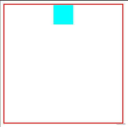
1、行内元素水平居中text-align:center,一个块级的容器包裹一个行内元素,行内元素水平居中,不需要知道该元素的宽高
/* HTML */
<div class='father'>
  <span class='son'></span>
</div>
<style>
  .father {
	text-align: center;
	width: 300px;
	height: 300px;
	border: 3px solid red;
  }
  .son {
	width: 50px;
	height: 50px;
	background-color: aqua;
	display: inline-block;
  }
</style>
效果展示
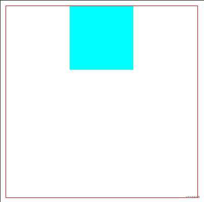
2、margin-left:auto,margin-right:auto。,块级元素水平居中,加上 text-align:center 让里面的文字水平居中。不需要知道元素的宽高,与父元素无关,只是显示出现水平居中了。
/* HTML */
<div class='father'>
  <div class='son'></div>
</div>
<style>
  .father {
	width: 300px;
	height: 300px;
	border: 1px solid red;
  }
  .son {
	width: 100px;
	height: 100px;
	background-color: aqua;
	/* 下面一行代码让文本水平居中 */
	text-align: center;
	margin-left: auto;
	margin-right: auto;
  }
</style>
效果展示
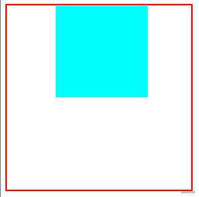
3、父元素display:table-cell;text-align:center,里面的子元素就会实现水平居中,不需要知道子元素的宽高
/* HTML */
<div class='father'>
  <span class='son'></span>
</div>
<style>
  .father {
	display: table-cell;
	text-align: center;
	width: 300px;
	height: 300px;
	border: 3px solid red;
  }
  .son {
	display: inline-block;
	width: 100px;
	height: 100px;
	background-color: aqua;
  }
</style>
效果展示

4、absolute+margin:auto,定位为 absolute 的元素水平居中,不需要知道该元素的宽高
/* HTML */
<div class='father'>
  <div class='son'></div>
</div>
<style>
  .father {
	position: relative;
	width: 300px;
	height: 300px;
	border: 3px solid red;
  }
  .son {
	width: 100px;
	height: 100px;
	background-color: aqua;
	position: absolute;
	left: 0;
	right: 0;
	margin: auto;
  }
</style>
效果展示

5、absolute+负margin,定位为 absolute 的元素水平居中,需要知道该元素的宽高
<!-- HTMl -->
<div class="father">
	<div class="son"></div>
</div>
<style>
  .father {
	position: relative;
	width: 300px;
	height: 300px;
	border: 3px solid red;
  }
  .son {
	position: absolute;
	width: 100px;
	height: 100px;
	background-color: aqua;
	left: 50%;
	/* 负margin须是宽度的一半 */
	margin-left: -50px;
  }
</style>
效果展示

6、absolute+calc(css3计算属性),定位为 absolute 的元素水平居中,需要知道该元素的宽高
<!-- HTMl -->
<div class="father">
	<div class="son"></div>
</div>
<style>
  .father {
	position: relative;
	width: 300px;
	height: 300px;
	border: 3px solid red;
  }
  .son {
	position: absolute;
	width: 100px;
	height: 100px;
	background-color: aqua;
	/* 注意"-"两边要隔开 减去的须是宽度或高度的一半*/
	left: calc(50% - 50px);
  }
</style>
效果展示

7、absolute+transform,定位为 absolute 的元素水平居中,不需要知道元素的宽高
<!-- HTMl -->
<div class="father">
	<div class="son"></div>
</div>
<style>
  .father {
	position: relative;
	width: 300px;
	height: 300px;
	border: 3px solid red;
  }
  .son {
	position: absolute;
	width: 100px;
	height: 100px;
	background-color: aqua;
	left: 50%;
	transform: translateX(-50%);
  }
</style>
效果展示
8、flex,目前主流的布局方案,父元素为 flex 容器且添加 justify-content: center;,控制子元素的布局。不需要知道子元素的宽高
<!-- HTMl -->
<div class="father">
	<div class="son"></div>
</div>
<style>
  .father {
	width: 300px;
	height: 300px;
	border: 3px solid red;
	display: flex;
	justify-content: center;
  }
  .son {
	background-color: aqua;
	width: 100px;
	height: 100px;
  }
</style>
效果展示

9、grid ,目前最强大的布局方案,使用还尚未流行。父元素为 grid,子元素添加 justify-self: center;。不需要知道子元素的宽高
<!-- HTMl -->
<div class="father">
	<div class="son"></div>
</div>
<style>
  .father {
	width: 300px;
	height: 300px;
	border: 3px solid red;
	display: grid;
  }
  .son {
	background-color: aqua;
	width: 100px;
	height: 100px;
	justify-self: center;
  }
</style>
效果展示

10、隐藏节点(盒子)实现 该原理就是使用盒子占位置,但不显示出该盒子。另外的盒子水平居中,子盒子的宽高需由实际计算时确定
<!-- HTML -->
<div class="father">
	<div class="hide"></div>
	<div class="son"></div>
</div>
<style>
  .father {
	width: 300px;
	height: 300px;
	border: 3px solid red;
  }
  .son {
	display: inline-block;
	background-color: aqua;
	width: 50%;
	height: 50%;
  }
  .hide {
	display: inline-block;
	width: 25%;
	height: 50px;
  }
</style>
效果展示
三、参考资料
张鑫旭 CSS 大佬
百度经验
常见问题FAQ
- 免费下载或者VIP会员专享资源能否直接商用?
- 本站所有资源版权均属于原作者所有,这里所提供资源均只能用于参考学习用,请勿直接商用。若由于商用引起版权纠纷,一切责任均由使用者承担。更多说明请参考 VIP介绍。
- 提示下载完但解压或打开不了?
- 找不到素材资源介绍文章里的示例图片?
- 模板不会安装或需要功能定制以及二次开发?


发表评论
还没有评论,快来抢沙发吧!