1、盒子模型
什么是盒子模型
所有HTML元素可以看作盒子,CSS盒模型本质上是一个盒子,封装周围的HTML元素,它包括:边距(margin),边框(border),填充(padding),和实际内容(content)
常见的盒子模型:标准盒子模型和IE盒子模型
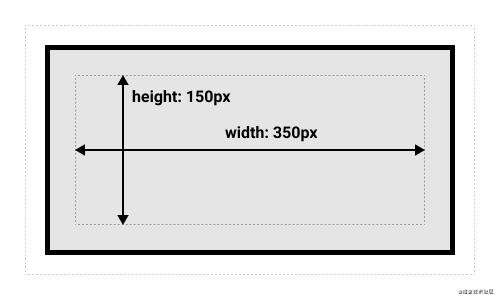
标准盒子模型
盒子的实际尺寸 = 内容(设置的宽/高) + 内边距 + 边框
如果使用标准模型宽度 = 410px (350 + 25 + 25 + 5 + 5),高度 = 210px (150 + 25 + 25 + 5 + 5),padding 加 border 再加 content box。
.box {
  width: 350px;
  height: 150px;
  margin: 25px;
  padding: 25px;
  border: 5px solid black;
}
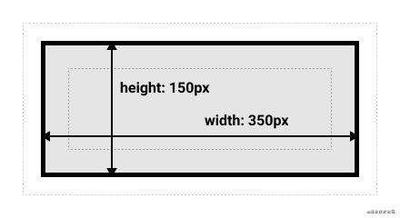
IE盒子模型
盒子的实际尺寸 = 设置的宽/高 = 内容 + 内边距 + 边框
现在高版本的浏览器基本上默认都是使用标准盒模型,而像 IE6 默认使用 IE 盒模型的 在 CSS3 中新增了一个属性 box-sizing,允许开发者来指定盒子使用什么标准,它有 2 个值:
content-box:标准盒模型; border-box:IE 盒模型;
2、BFC
BFC(Block Formating Context)块级格式化上下文,是CSS中的一种渲染机制。是一个拥有独立渲染区域的盒子,规定了内部元素如何布局,并且盒子内部元素与外部元素互不影响。
BFC 渲染规则
- 内部的盒子会在垂直方向,一个接一个地放置;
- 盒子垂直方向的距离由 margin 决定,
- 属于同一个 BFC 的两个相邻盒子的 margin 会发生重叠;
- 每个元素的 margin 的左边,与包含块 border 的左边相接触(对于从左往右的格式化,否则相反),即使存在浮动也是如此;
- BFC 的区域不会与 float 盒子重叠;
- BFC 就是页面上的一个隔离的独立容器,容器里面的子元素不会影响到外面的元素。反之也如此。
- 计算 BFC 的高度时,浮动元素也参与计算。
如何创建 BFC?
- 根元素:html
- 非溢出的可见元素:overflow 不为 visible
- 设置浮动:float 属性不为 none
- 设置定位:position 为 absolute 或 fixed
- 定义成块级的非块级元素:display: inline-block/table-cell/table-caption/flex/inline-flex/grid/inline-grid
BFC的应用
1、两栏布局
BFC 的区域不会与 float 盒子重叠
 <div class="layout">
  <div class="aside">aside</div>
  <div class="main">main</div>
</div>


<style>
  .aside{
     width:120px;
     float:left;
  }
  .main{
    background-color: blue;
    overflow: hidden;
  }
</style>
2、margin间距合并
属于同一个 BFC 的两个相邻盒子的 margin 会发生重叠;
 <div class="parent">
   <div class="child child1">我是child1</div>
   <div class="child child2">我是child1</div>
 </div>

 <style>
    .child1{
      margin-bottom:10px;
      margin-top:10px;
      background-color: green;
    }
    .child2{
      background-color: red;
      margin-top:10px;
    }
 </style>
我们以为child1和child2的间距会是20px,但是由于BFC的两个相邻盒子的 margin 会发生重叠,他们之间的间距会取最大的值作为结果,即10px,那如何解决呢?
再创建一个div父元素包裹,创建两个BFC,但是这样就改变了dom的结构,我们一般不建议这样做,我们直接设置一个margin值是两个值的和即可
 <div class="parent">
   <div class="child child1">我是child1</div>
   <div class="wrap"><div class="child child2">我是child1</div></div>
 </div>
 <style>

     .parent{
      background-color: blue;
    }
    .child1{
      margin-bottom:10px;
      margin-top:10px;
      background-color: green;
    }
    .child2{
      background-color: red;
      margin-top:10px;
    }
    .wrap{
      overflow: hidden;
    }
 </style>
3、margin 塌陷
什么是margin塌陷,我们来看一段代码
<style>
   .parent{
      background-color: blue;
      height: 100px;
    }
    .child{
      margin-top:100px;
      height: 20px;
      background-color: green;
    }
</style>

 <div class="parent">
   <div class="child">我是child</div>
 </div>
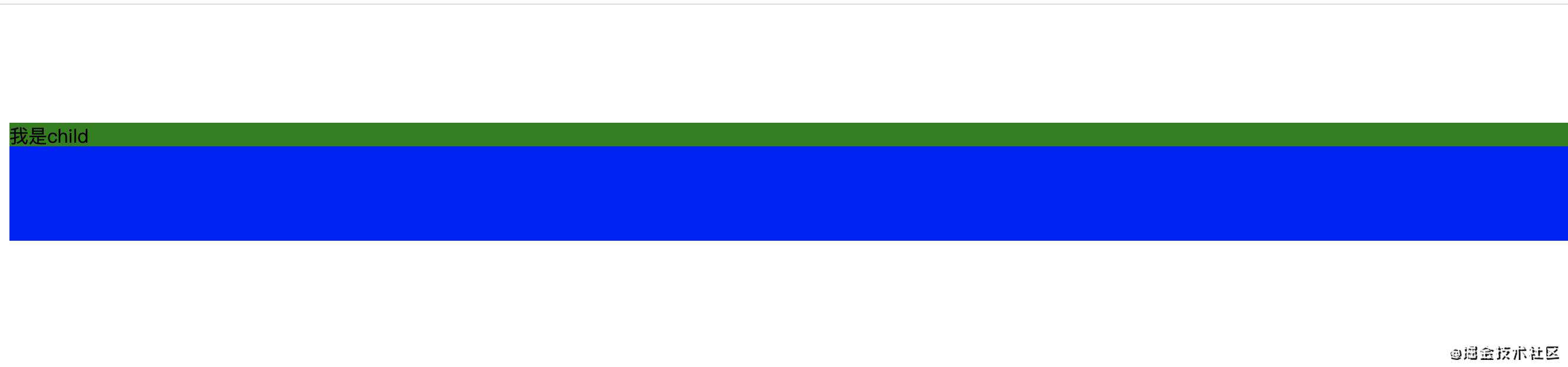
child并没有距离parent 100px,而是parent距离顶部100px,这就是margin塌陷,那如何解决呢? 我们还是利用BFC ,给parent创建一个BFC
<style>
   .parent{
      background-color: blue;
      height: 100px;
      overflow:hidden;
    }
    .child{
      margin-top:100px;
      height: 20px;
      background-color: green;
    }
</style>

 <div class="parent">
   <div class="child">我是child</div>
 </div>
4、清除浮动
这个就不多说了,大家都知道
3、css隐藏元素的方式以及区别
- opacity:0,该元素隐藏起来了,但不会改变页面布局,并且,如果该元素已经绑定 一些事件,如 click 事件,那么点击该区域,也能触发点击事件的
- visibility:hidden,该元素隐藏起来了,但不会改变页面布局,但是不会触发该元素已经绑定的事件
- display:none,把元素隐藏起来,并且会改变页面布局,可以理解成在页面中把该元 素删除掉。
4、元素居中的几种方式
固定宽度
1、子元素利用position和margin为宽高的一半来实现
<style>
    .parent1{
      width: 200px;
      height: 200px;
      position: relative;
      background-color: red;
    }
    .chid1{
      width: 50px;
      height: 100px;
      position: absolute;
      left:50%;
      top:50%;
      background-color: gray;
      margin-left:-25px;
      margin-top:-50px;
    }
</style>
  <div class="parent1">
    <div class="chid1">child1</div>
  </div>
2、子元素设置 position: absolute,margin:auto 平均分配 margin
<style>
.parent2{
      width: 200px;
      height: 200px;
      position: relative;
      background-color: red;
      margin-top:100px;
    }
    .chid2{
      width: 50px;
      height: 100px;
      position: absolute;
      margin:auto;
      left:0;
      top:0;
      right:0;
      bottom:0;
      background-color: gray;
    }
</style>


 <div class="parent2">
    <div class="chid2">child2</div>
  </div>
不定宽度
1、子元素通过transform来实现
<style>
    .parent3{
      width: 200px;
      height: 200px;
      position: relative;
      background-color: red;
      margin-top:100px;
    }
    .chid3{

      position: absolute;
      margin:auto;
      left:50%;
      top:50%;
      transform:translate(-50%,-50%);
      background-color: gray;
    }
</style>
 <div class="parent3">
    <div class="chid3">child3</div>
  </div>
2、父元素设置display:flex来实现
.parent4{
      width: 200px;
      height: 200px;
      position: relative;
      background-color: red;
      margin-top:100px;
      display: flex;
      justify-content: center;
      align-items: center;
    }
    .chid4{

      background-color: gray;
    }

     <div class="parent4">
    <div class="chid4">child4</div>
  </div>
3、父元素设置display:table-cell来实现
    .parent5{
      width: 200px;
      height: 200px;
      position: relative;
      background-color: red;
      margin-top:100px;
     display: table-cell;
     vertical-align: middle;
      text-align: center
    }
    .chid5{
      display: inline-block;
      background-color: gray;
    }

      <div class="parent5">
            <div class="chid5">child5</div>
      </div>
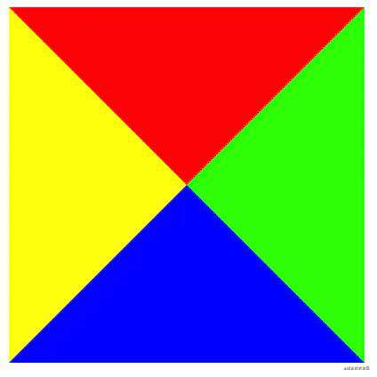
5、如何画一个三角形
利用元素的 border 绘制三角形,先来看一下宽高均为 0,border 有宽度的效果
<style>
.triangle {
            width: 0;
            height: 0;
            border-top: 100px solid #f00;
            border-right: 100px solid #0f0;
            border-bottom: 100px solid #00f;
            border-left: 100px solid #ff0;
        }
</style>

<div class="triangle"></div>
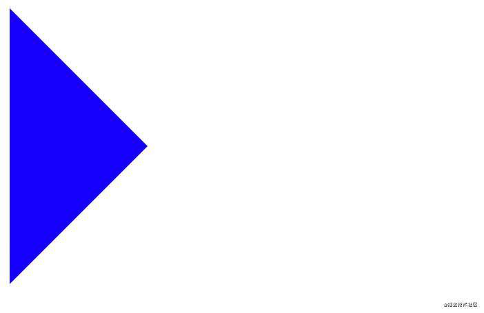
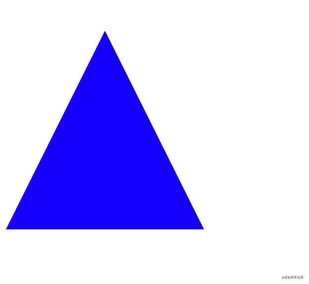
接下来我们就是给给任意一个边设置颜色,其他边设置透明,来实现不同方向的三角形
    .triangle {
                width: 0;
                height: 0;
                border: 100px solid transparent;
                border-bottom: 100px solid #00f;
            }
    </style>

    <div class="triangle"></div>
    .triangle {
                width: 0;
                height: 0;
                border: 100px solid transparent;
                border-left: 100px solid #00f;
            }
    </style>

    <div class="triangle"></div>
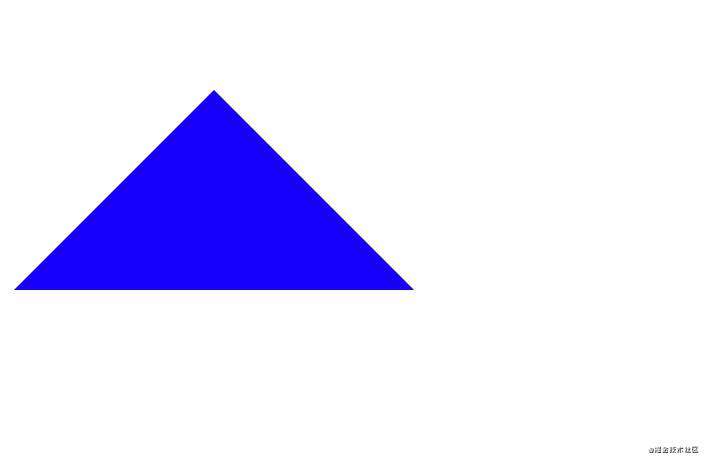
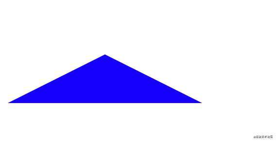
依次类推,就可以设置不同方向的三角形,那如果想让三角形变高,就调整设置方向的数值,让他变大
    .triangle {
                width: 0;
                height: 0;
                border: 100px solid transparent;
                border-bottom: 200px solid #00f;
            }
    </style>

    <div class="triangle"></div>
    .triangle {
                width: 0;
                height: 0;
                border: 100px solid transparent;
                border-bottom: 50px solid #00f;
            }
    </style>

    <div class="triangle"></div>
6、如何使footer永远处于页面的底部
内容区域的padding值就是footer的高度,切一定要让container设置min-height
  <style>
    html,body{
      height: 100%;
      min-height: 100%;
    }
    .footer{
      position:absolute;
      height: 200px;
      bottom: 0;
      width: 100%;
      background-color: gray;
    }
    .container{
      position: relative;
      min-height: 100%;
    }
    .main{
      padding-bottom: 200px;
    }
  </style>
  <div class="container">
    <div class="main">我是content</div>
    <div class="footer">我是footer</div>
  </div>
参考
juejin.cn/post/694120…
juejin.cn/post/684490…
常见问题FAQ
- 免费下载或者VIP会员专享资源能否直接商用?
- 本站所有资源版权均属于原作者所有,这里所提供资源均只能用于参考学习用,请勿直接商用。若由于商用引起版权纠纷,一切责任均由使用者承担。更多说明请参考 VIP介绍。
- 提示下载完但解压或打开不了?
- 找不到素材资源介绍文章里的示例图片?
- 模板不会安装或需要功能定制以及二次开发?


发表评论
还没有评论,快来抢沙发吧!