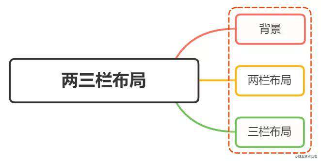
背景
在日常的开发中和面试中,总能遇到两栏布局或者三栏布局,今天就给小伙伴简单介绍一下。
两栏布局
两栏布局实现效果就是将页面分割成左右宽度不等的两列,宽度较小的列设置为固定宽度,剩余宽度由另一列撑满。
比如 element-ui 文档,蓝色区域为主要内容布局容器,侧边栏为次要内容布局容器。
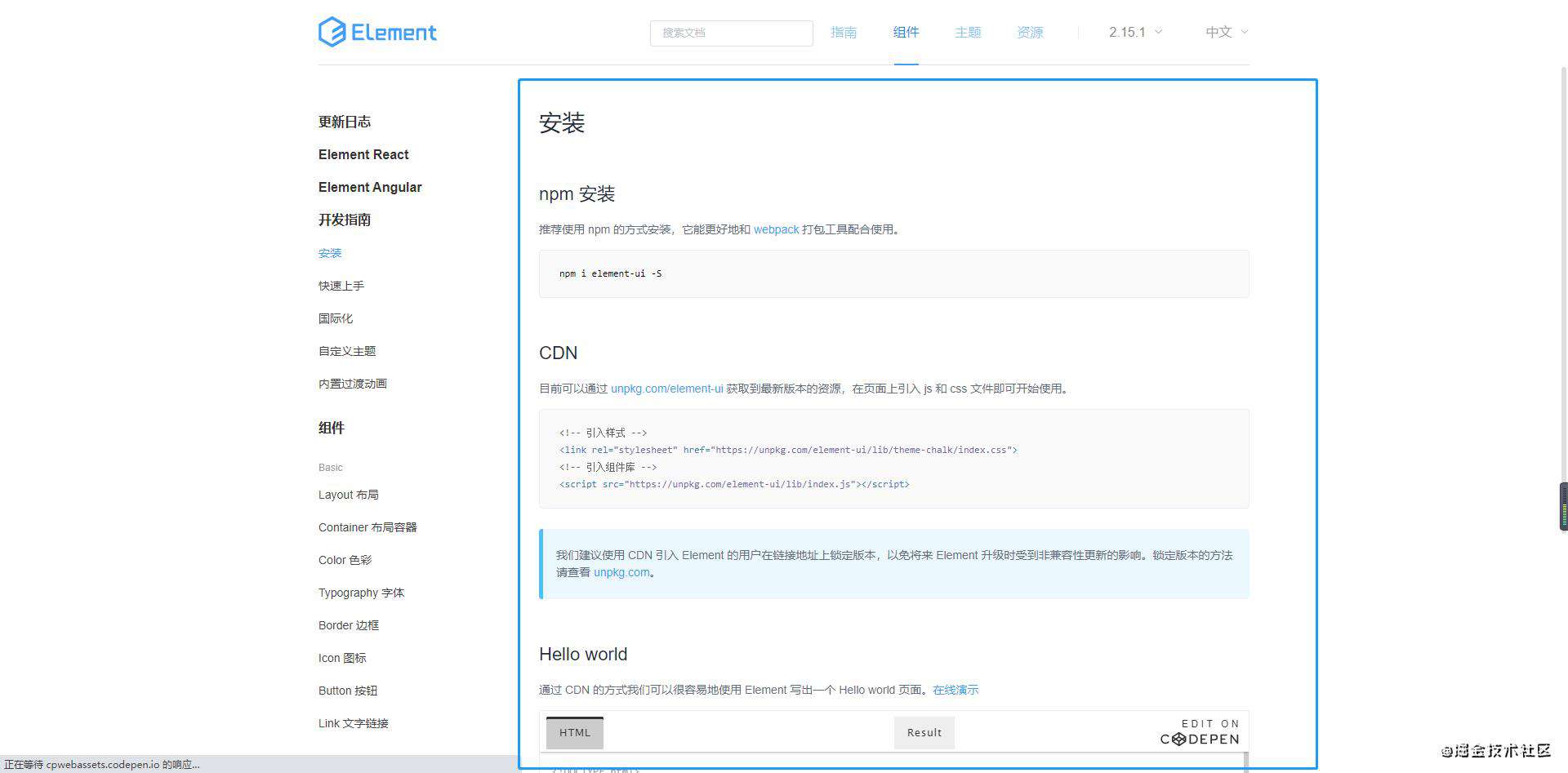 这种布局适用于内容上具有明显主次关系的网页
三栏布局
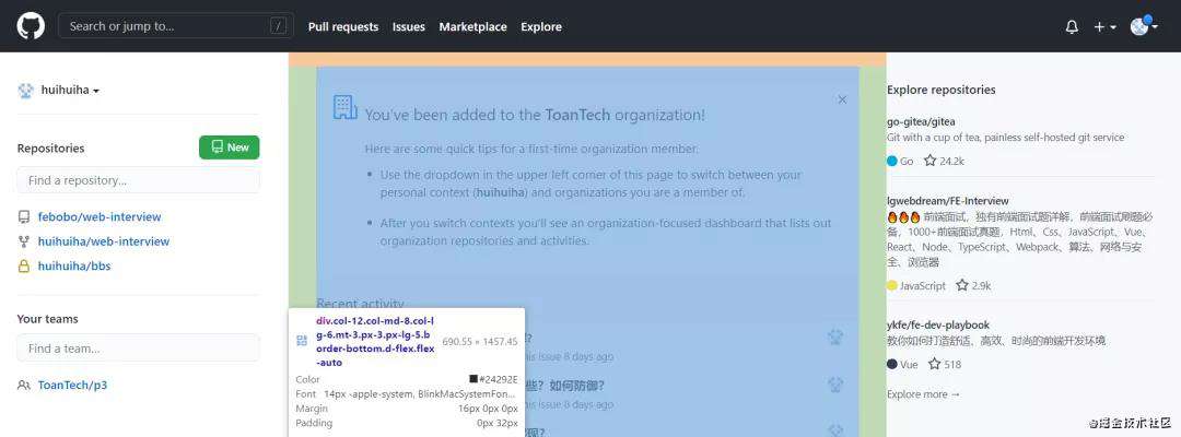
三栏布局按照左中右的顺序进行排列,通常中间列最宽,左右两列次之
大家最常见的就是github:
双栏布局
双栏布局非常常见,往往是以一个定宽栏和一个自适应的栏并排展示存在
实现思路也非常的简单:
- 使用 float 左浮左边栏
- 右边模块使用 margin-left 撑出内容块做内容展示
- 为父级元素添加BFC,防止下方元素飞到上方内容
<style>
    .box{
        overflow: hidden; 添加BFC
    }
    .left {
        float: left;
        width: 200px;
        background-color: gray;
        height: 400px;
    }
    .right {
        margin-left: 210px;
        background-color: lightgray;
        height: 200px;
    }
</style>
<div class="box">
    <div class="left">左边</div>
    <div class="right">右边</div>
</div>
还有一种更为简单的使用则是采取:flex弹性布局
<style>
    .box{
        display: flex;
    }
    .left {
        width: 100px;
    }
    .right {
        flex: 1;
    }
</style>
<div class="box">
    <div class="left">左边</div>
    <div class="right">右边</div>
</div>
flex可以说是最好的方案了,代码少,使用简单
注意的是,flex容器的一个默认属性值:align-items: stretch;
这个属性导致了列等高的效果。为了让两个盒子高度自动,需要设置: align-items: flex-start
两栏布局的实现方法还有很多,这里只介绍这些
三栏布局
实现三栏布局中间自适应的布局方式有:
- 两边使用 float,中间使用 margin
- 两边使用 absolute,中间使用 margin
- 两边使用 float 和负 margin
- display: table 实现
- flex实现
- grid网格布局
两边使用 float,中间使用 margin
需要将中间的内容放在html结构最后,否则右侧会出现在中间内容的下方
实现代码如下:
<style>
    .wrap {
        background: #eee;
        overflow: hidden; <!-- 生成BFC,计算高度时考虑浮动的元素 -->
        padding: 20px;
        height: 200px;
    }
    .left {
        width: 200px;
        height: 200px;
        float: left;
        background: coral;
    }
    .right {
        width: 120px;
        height: 200px;
        float: right;
        background: lightblue;
    }
    .middle {
        margin-left: 220px;
        height: 200px;
        background: lightpink;
        margin-right: 140px;
    }
</style>
<div class="wrap">
    <div class="left">左侧</div>
    <div class="right">右侧</div>
    <div class="middle">中间</div>
</div>
原理如下:
- 两边固定宽度,中间宽度自适应。
- 利用中间元素的margin值控制两边的间距
- 宽度小于左右部分宽度之和时,右侧部分会被挤下去
这种实现方式存在缺陷:
- 主体内容是最后加载的。
- 右边在主体内容之前,如果是响应式设计,不能简单的换行展示
两边使用 absolute,中间使用 margin
基于绝对定位的三栏布局:注意绝对定位的元素脱离文档流,相对于最近的已经定位的祖先元素进行定位。无需考虑HTML中结构的顺序
<style>
  .container {
    position: relative;
  }

  .left,
  .right,
  .main {
    height: 200px;
    line-height: 200px;
    text-align: center;
  }

  .left {
    position: absolute;
    top: 0;
    left: 0;
    width: 100px;
    background: green;
  }

  .right {
    position: absolute;
    top: 0;
    right: 0;
    width: 100px;
    background: green;
  }

  .main {
    margin: 0 110px;
    background: black;
    color: white;
  }
</style>

<div class="container">
  <div class="left">左边固定宽度</div>
  <div class="right">右边固定宽度</div>
  <div class="main">中间自适应</div>
</div>
实现流程:
- 左右两边使用绝对定位,固定在两侧。
- 中间占满一行,但通过 margin和左右两边留出10px的间隔
两边使用 float 和负 margin
<style>
  .left,
  .right,
  .main {
    height: 200px;
    line-height: 200px;
    text-align: center;
  }

  .main-wrapper {
    float: left;
    width: 100%;
  }

  .main {
    margin: 0 110px;
    background: black;
    color: white;
  }

  .left,
  .right {
    float: left;
    width: 100px;
    margin-left: -100%;
    background: green;
  }

  .right {
    margin-left: -100px; /* 同自身宽度 */
  }
</style>

<div class="main-wrapper">
  <div class="main">中间自适应</div>
</div>
<div class="left">左边固定宽度</div>
<div class="right">右边固定宽度</div>
实现过程:
- 中间使用了双层标签,外层是浮动的,以便左中右能在同一行展示
- 左边通过使用负 margin-left:-100%,相当于中间的宽度,所以向上偏移到左侧
- 右边通过使用负 margin-left:-100px,相当于自身宽度,所以向上偏移到最右侧
缺点:
- 增加了 .main-wrapper 一层,结构变复杂
- 使用负 margin,调试也相对麻烦
使用 display: table 实现
table 标签用于展示行列数据,不适合用于布局。但是可以使用 display: table 来实现布局的效果
<style>
  .container {
    height: 200px;
    line-height: 200px;
    text-align: center;
    display: table;
    table-layout: fixed;
    width: 100%;
  }

  .left,
  .right,
  .main {
    display: table-cell;
  }

  .left,
  .right {
    width: 100px;
    background: green;
  }

  .main {
    background: black;
    color: white;
    width: 100%;
  }
</style>

<div class="container">
  <div class="left">左边固定宽度</div>
  <div class="main">中间自适应</div>
  <div class="right">右边固定宽度</div>
</div>
实现原理:
- 通过 display: table设置为表格,设置 table-layout: fixed表示列宽自身宽度决定,而不是自动计算。
- 内层的左中右通过 display: table-cell设置为表格单元。
- 左右设置固定宽度,中间设置 width: 100% 填充剩下的宽度
使用flex实现
利用flex弹性布局,可以简单实现中间自适应 代码如下:
<style type="text/css">
    .wrap {
        display: flex;
        justify-content: space-between;
    }

    .left,
    .right,
    .middle {
        height: 100px;
    }

    .left {
        width: 200px;
        background: coral;
    }

    .right {
        width: 120px;
        background: lightblue;
    }

    .middle {
        background: #555;
        width: 100%;
        margin: 0 20px;
    }
</style>
<div class="wrap">
    <div class="left">左侧</div>
    <div class="middle">中间</div>
    <div class="right">右侧</div>
</div>
实现过程:
- 仅需将容器设置为display:flex;,
- 盒内元素两端对其,将中间元素设置为100%宽度,或者设为flex:1,即可填充空白
- 盒内元素的高度撑开容器的高度
优点:
- 结构简单直观
- 可以结合 flex的其他功能实现更多效果,例如使用 order属性调整显示顺序,让主体内容优先加载,但展示在中间
grid网格布局
代码如下:
<style>
    .wrap {
        display: grid;
        width: 100%;
        grid-template-columns: 300px auto 300px;
    }

    .left,
    .right,
    .middle {
        height: 100px;
    }

    .left {
        background: coral;
    }

    .right {
        width: 300px;
        background: lightblue;
    }

    .middle {
        background: #555;
    }
</style>
<div class="wrap">
    <div class="left">左侧</div>
    <div class="middle">中间</div>
    <div class="right">右侧</div>
</div>
跟flex弹性布局一样的简单
常见问题FAQ
- 免费下载或者VIP会员专享资源能否直接商用?
- 本站所有资源版权均属于原作者所有,这里所提供资源均只能用于参考学习用,请勿直接商用。若由于商用引起版权纠纷,一切责任均由使用者承担。更多说明请参考 VIP介绍。
- 提示下载完但解压或打开不了?
- 找不到素材资源介绍文章里的示例图片?
- 模板不会安装或需要功能定制以及二次开发?


发表评论
还没有评论,快来抢沙发吧!