在 CSS 中,文字算是我们天天会打交道的一大类了,有了文字,则必不可少一些文字装饰。
本文将讲讲两个比较新的文字装饰的概念 text-decoration 与 text-emphasis,在最后,还会讲解使用 background 模拟文字下划线的一些有趣的动效。
text-decoration 文字装饰
text-decoration 意为文字装饰,在很早的规范 CSS Level 2 (Revision 1) -- text-decoration 就已经存在了。譬如我们非常熟知的下划线 text-decoration: underline。
p {
    text-decoration: underline;
}

而到了比较新的 CSS Text Decoration Module Level 3 - text-decoration,text-decoration 得到了比较大的丰富更新,演化出了 text-decoration-line, text-decoration-color, text-decoration-style,和还未成为标准的 text-decoration-thickness 等属性,是它们的缩写。
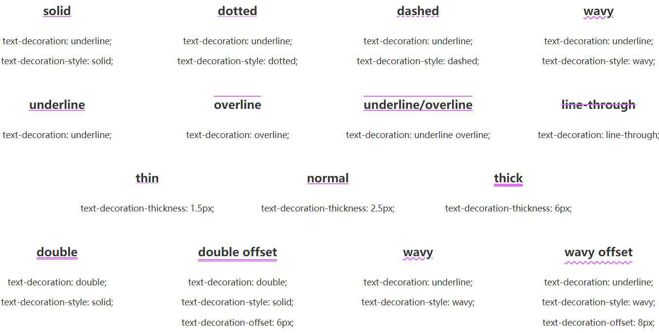
其中:
text-decoration-line:控制用于设置元素中的文本的修饰类型,是在文本下方、上方还是贯穿文本text-decoration-style:不仅仅是实线solid,类似于border-style,还支持双实线double、点划线dotted、虚线dashed以及非常有意思的wavy波浪线text-decoration-color:这个好理解,控制颜色text-decoration-thickness:控制修饰线的粗细
这里有张非常好的图,帮助大家快速理解:
CodePen Demo -- Text-decoration Demo
text-decoration-line 可以同时设置
有意思的一点是,text-decoration-line 可以同时设置。
p {
    text-decoration-line: overline underline line-through;
}
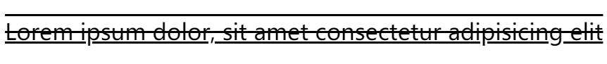
我们可以得到上中下三条线。
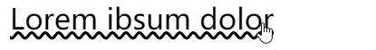
text-decoration 可以进行过渡与动画
text-decoration 的每个值都是可以进行过渡与动画的。合理利用,在一些文本强调的地方,非常有用。
<p class="transition">Lorem ipsum dolor</p>
.transition {
    text-decoration-line: underline;
    text-decoration-color: transparent;
    text-decoration-thickness: 0.1em;
    cursor: pointer;
    transition: .5s;

    &:hover {
        text-decoration-color: pink;
        text-decoration-thickness: 0.15em;
        color: pink;
    }
}
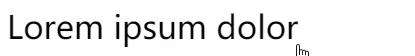
配合另外一个属性 text-underline-offset,我们还可以实现如下图这样有趣的效果:

当然,上述的例子中使用了 text-underline-offset 的变换,但是本身 CSS 是不支持 text-underline-offset 的过渡动画的,这里借助了 CSS @property 巧妙的实现了 text-underline-offset 的过渡动画,感兴趣的可以具体了解下 CSS @property 的用法。
CodePen Demo -- 文字下划线过渡动画效果
text-decoration-color 与 color 分离
text-decoration-color 与 color 是可以不一样的,类似于这样。
.color {
    text-decoration-style: wavy;
    cursor: pointer;
    transition: .5s;

    &:hover {
        color: transparent;
        text-decoration-color: pink;
    }
}
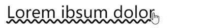
有意思,经过这样,我们其实得到了一条波浪线。
如果我们把 wavy 下划线加给元素的伪元素,然后在 hover 的时候添加一个动画,让波浪线动起来,得到一个非常好的强调 hover 效果:
<p class="animation" data-content="Lorem ibsum dolor Lorem ibsum dolor">Lorem ibsum dolor</p>
.animation {
    position: relative;
    text-decoration: none;
    overflow: hidden;
    cursor: pointer;
    line-height: 2;

    &::before {
        content: attr(data-content);
        position: absolute;
        top: 0;
        left: 0;
        color: transparent;
        white-space: nowrap;
        text-decoration-line: underline;
        text-decoration-style: wavy;
        text-decoration-color: #000;
        z-index: -1;
    }
    &:hover::before {
        animation: move 3s infinite linear;
    }
}
@keyframes move {
    100% {
        transform: translate(-209px, 0);
    }
}
我们利用伪元素添加了一段长于文本本身的文本,并且颜色为透明,但是设置了波浪线的颜色,然后 hover 的时候,通过运动伪元素的 translate 进行波浪线的位移,稍微调试一下 translate 的值,可以做到动画的首尾相连,实现运动的波浪线的效果。
CodePen Demo -- text-decoration Demo
text-emphasis 文字强调
text-emphasis 意为文字强调,是 CSS Text Decoration Module Level 3 才新增的一个属性,用于增强文字强调的效果。
在早些时候,我们如果要强调几个字,可能更多是使用加粗,斜体这种较为常规的文字样式类型:
{
    font-weight: bold;   // 加粗
    font-style: italic;  // 斜体
}
现在,多了一种有意思的强调方式 -- text-emphasis。
text-emphasis 语法
text-emphasis 包含了 text-emphasis 和 text-emphasis-position,允许我们在文字上方或者下方添加不同的强调装饰以及不同的颜色。
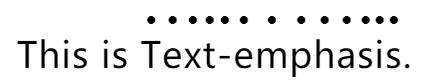
看个简单的 Demo:
<p>
   This is <span>Text-emphasis</span>.
</p>
p span{
    text-emphasis: circle;
}
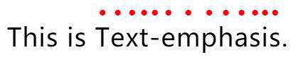
text-emphasis: circle 的效果是给包裹的文字,在其上方,添加 circle 图形,也就是圆圈图形,效果如下:
当然,默认是黑色的,我们可以在 circle 后面补充颜色:
p span{
    text-emphasis: circle #f00;
}
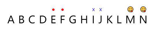
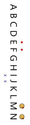
除了 circle,还提供非常多种图形可以选择,也可以自定义传入字符,甚至是 emoji 表情:
<p>
    A B C D
    <span class="keyword">E F</span>
    G H
    <span class="word">I J</span>
    K L
    <span class="emoji">M N</span>
</p>
.keyword {
    text-emphasis: circle #f00;
}
.word {
    text-emphasis: 'x' blue;
}
.emoji {
    text-emphasis: '?';
}
text-emphasis-position 语法
除了在文字上方,还可以在一定范围内改变强调图形的位置,选择放置在文字的上方或者下方,利用 text-emphasis-position。
这个属性接受上下与左右两个参数:
text-emphasis-position: [ over | under ] && [ right | left ]?
.keyword {
    text-emphasis: circle #f00;
}
.word {
    text-emphasis: 'x' blue;
    text-position: over left;
}
.emoji {
    text-emphasis: '?';
    text-position: under left;
}
当文字的排版的书写顺序是水平排版布局,类似 writing-mode: lr 时,只需要用到 over、under 即可,当文本的排版布局模式是垂直模式时,类似 writing-mode: vertical-lr,才会用到 right 或者 left 关键字。
p {
    writing-mode: vertical-rl;
}
.keyword {
    text-emphasis: circle #f00;
}
.word {
    text-emphasis: 'x' blue;
    text-position: over left;
}
.emoji {
    text-emphasis: '?';
    text-position: under right;
}
使用 background 模拟下划线
除了 CSS 原生提供的 text-decoration 与 text-emphasis 之外,我们还可以通过其他元素模拟一些文字装饰效果。
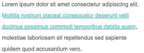
最常见的莫过于使用 background 模拟下划线了。
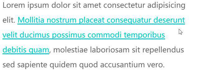
看个简单的 DEMO,使用 background 模拟文字的下划线效果:
<p>Lorem ipsum dolor sit amet consectetur adipisicing elit. <a>Mollitia nostrum placeat consequatur deserunt velit ducimus possimus commodi temporibus debitis quam</a>, molestiae laboriosam sit repellendus sed sapiente quidem quod accusantium vero.</p>
p {
    width: 600px;
    font-size: 24px;
    color: #666;
}
a {
    background: linear-gradient(90deg, #0cc, #0cc);
    background-size: 100% 3px;
    background-repeat: no-repeat;
    background-position: 100% 100%;
    color: #0cc;
}
使用 background 模拟文字的下划线效果,效果图如下:
又或者,使用 background 模拟虚线下划线:
a {
    background: linear-gradient(90deg, #0cc 50%, transparent 50%, transparent 1px);
    background-size: 10px 2px;
    background-repeat: repeat-x;
    background-position: 100% 100%;
}
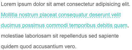
CodePen Demo -- 使用 background 模拟下划线与虚线下划线
当然这个是最基础的,巧妙的运用 background 的各种属性,我们实现各种有意思的效果。
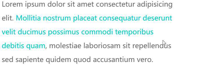
巧妙改变 background-size 与 background-position 实现文字 hover 动效
这里,通过巧妙改变 background-size 与 background-position 属性,我们可以实现一些非常有意思的文字 hover 效果。
先看这样一个 Demo,核心代码作用于被 <p> 标签包裹的 <a> 标签之上:
<p>Lorem ipsum dolor sit amet consectetur adipisicing elit. <a>Mollitia nostrum placeat consequatur deserunt velit ducimus possimus commodi temporibus debitis quam</a>, molestiae laboriosam sit repellendus sed sapiente quidem quod accusantium vero.</p>
a {
    background: linear-gradient(90deg, #ff3c41, #fc0, #0ebeff);
    background-size: 0 3px;
    background-repeat: no-repeat;
    background-position: 0 100%;
    transition: 1s all;
    color: #0cc;
}

a:hover {
    background-size: 100% 3px;
    color: #000;
}
我们虽然,设定了 background: linear-gradient(90deg, #ff3c41, #fc0, #0ebeff),但是一开始默认它的 background-size: 0 3px,也就是一开始是看不到下划线的,当 hover 的时候,改变 background-size: 100% 3px,这个时候,就会有一个 0 3px 到 100% 3px 的变换,也就是一个从无到有的伸展效果。
看看最后的效果:

由于设定的 background-position 是 0 100%,如果,设定的 background-position 是 100% 100%,我们可以得到一个反向的效果:
// 其他都保持一致,只改变 background-position,从 0 100% 改为 100% 100%
a {
    ...
    background-position: 100% 100%;
    ...
}
再看看效果,你可以对比着上面的动图看看具体的差异点在哪:
CodePen Demo -- background underline animation
OK,如果我们使用 background 实现两条重叠的下划线,再利用上述的两个不同的 background-position 值,我们就可以得到一个更有意思的下划线 hover 效果。
CSS 代码示意,注意看两条使用 background 模拟的下划线的 background-position 的值是不一样的:
a {
    background:
        linear-gradient(90deg, #0cc, #0cc),
        linear-gradient(90deg, #ff3c41, #fc0, #8500d8);
    background-size: 100% 3px, 0 3px;
    background-repeat: no-repeat;
    background-position: 100% 100%, 0 100%;
    transition: 0.5s all;
    color: #0cc;
}
a:hover {
    background-size: 0 3px, 100% 3px;
    color: #000;
}
可以得到这样一种效果,其实每次 hover, 都有两条下划线在移动:
CodePen Demo -- background underline animation
最后
好了,本文到此结束,介绍了关于文字装饰的一些有意思的属性及动效,希望对你有帮助 :)
想 Get 到最有意思的 CSS 资讯,千万不要错过我的公众号 -- iCSS前端趣闻 ?
更多精彩 CSS 技术文章汇总在我的 Github -- iCSS ,持续更新,欢迎点个 star 订阅收藏。
如果还有什么疑问或者建议,可以多多交流,原创文章,文笔有限,才疏学浅,文中若有不正之处,万望告知。
常见问题FAQ
- 免费下载或者VIP会员专享资源能否直接商用?
- 本站所有资源版权均属于原作者所有,这里所提供资源均只能用于参考学习用,请勿直接商用。若由于商用引起版权纠纷,一切责任均由使用者承担。更多说明请参考 VIP介绍。
- 提示下载完但解压或打开不了?
- 找不到素材资源介绍文章里的示例图片?
- 模板不会安装或需要功能定制以及二次开发?


发表评论
还没有评论,快来抢沙发吧!