HTML语义化
1.提高代码的可读性,可以更快的了解到页面的布局。
2.让搜索引擎的爬虫程序更容易理解代码。
常见的语义化标签有:
<header> <main> <footer> <nav>
块级元素和内联元素
块级元素:display:block/table
特点:独占一行。 div h1(hx) p ul li table form
内联元素:display:inline/inline-block。
特点:不会独占一行,紧跟着排列,直到没有足够空间才换行。 span strong a img select iframe
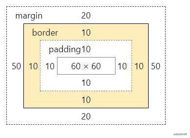
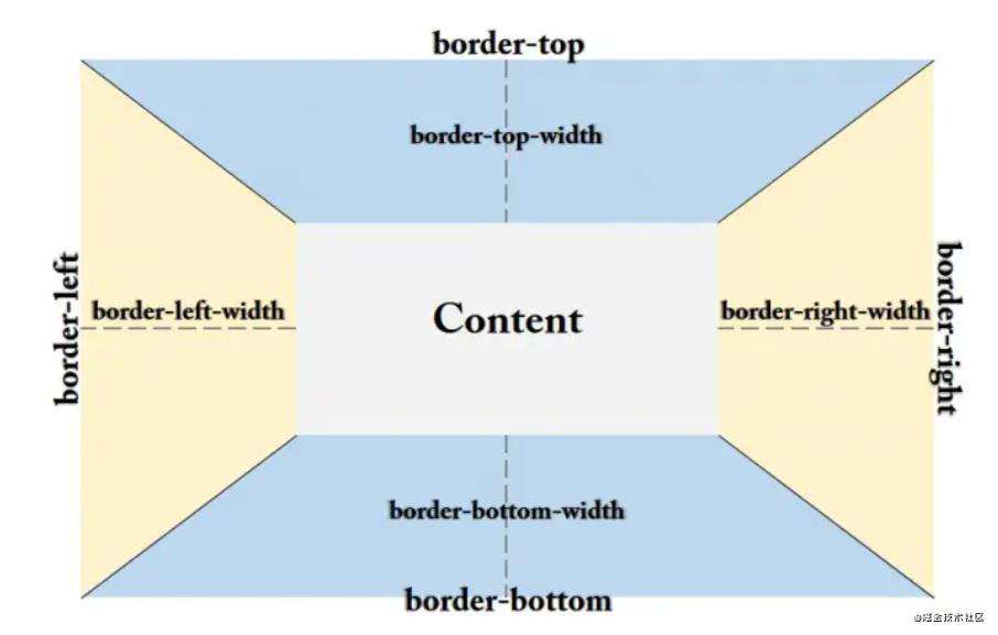
盒模型
盒模型是: 内容(content)、填充(padding)、边界(margin)、 边框(border)。
使用box-sizing来控制盒子模型的解析模式,默认content-box(标准盒模式),border-box是IE盒模式。
IE盒模型(box-sizing:border-box)
宽度 = 内容宽度width(content+border+padding)+margin
        .box{
            box-sizing:border-box;
            width:100px;//两边的padding+两边的border+content = width
            height:100px;
            background-color: aquamarine;
            padding:10px;
            margin: 20px 50px;
            border: 10px solid black;
        }
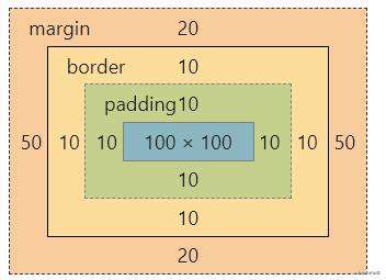
W3C盒模型(box-sizing:content-box)
宽度 = 内容宽度width(content)+border+padding+margin
        .box{
            box-sizing:content-box;
            width:100px;
            height:100px;
            background-color: aquamarine;
            padding:10px;
            margin: 20px 50px;
            border: 10px solid black;
        }
布局
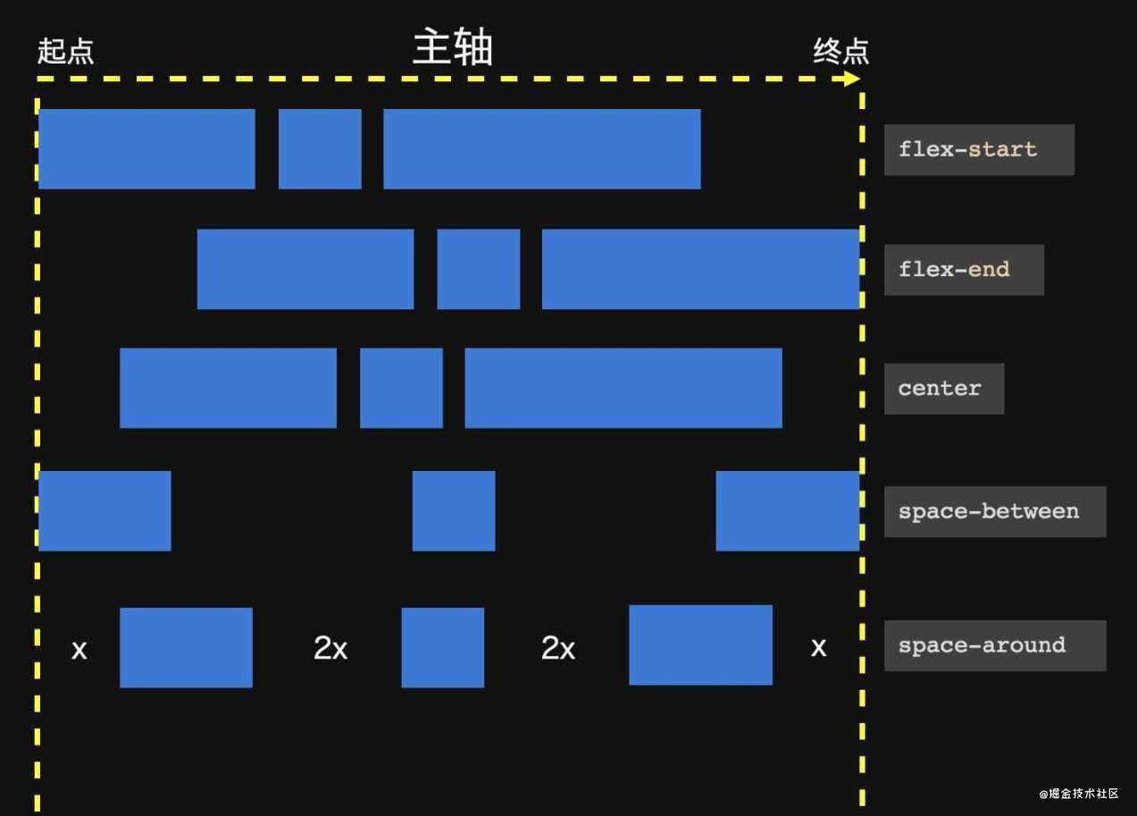
flex
flex是CSS3提出的一种新的布局方法。 设置为flex的容器,内部会有两个轴,一个是主轴(默认水平 从左到右),一个是交叉轴,盒子内部的项目会按照主轴进行排列。 www.bilibili.com/video/BV1Lp…
        .container{
            background-color: brown;
            height:500px;
            display: flex;/*开启flex布局*/
            flex-flow: row wrap;/* 主轴是水平的 换行*/
            justify-content:center;/*主轴上项目的对齐方式*/
            /*align-items:center;/*交叉轴 单行 项目的对齐方式*/
            align-content:center;/*交叉轴 多行 项目的对齐方式*/
        }
        .box{
            background-color: bisque;
            width:50px;
            height:50px;
            margin:10px;
        }
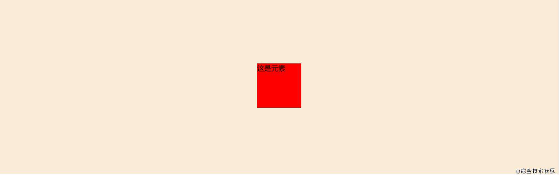
垂直居中
        .container{
            width:100%;
            height:400px;
            background-color:antiquewhite;
            display:flex;
            justify-content:center;
            align-items:center;
        }
        .element{
            width:100px;
            height:100px;
            background-color:red;
        }
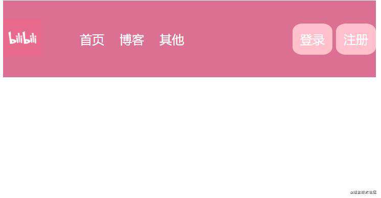
 导航栏布局
导航栏布局
    header{
            width:100%;
            height:100px;
            background-color: palevioletred;
            color:white;

            display:flex;
            flex-direction:row;
            align-items:center;
        }
        nav,ul{
            display:flex;
            flex-direction:row;
            align-items:center;
        }
        nav {
            margin-right:auto;/*会把同级的兄弟元素顶到最右边*/
        }

        li{
            list-style-type: none;
            background-color: palevioletred;
            margin:5px 10px;
        }
        span{
            padding:10px;
            background-color: pink;
            border-radius:25%;
        }


 <header>
        <nav>
            <a><img width="50px" height=" 50px" src="https://mt.lenovo.com.cn/c/114/1542708313996.png"/></a>
            <ul>
                <li>首页</li>
                <li>博客</li>
                <li>其他</li>
            </ul>
        </nav>
        <div>
            <span>登录</span>
            <span>注册</span>
        </div>
    </header>
两栏布局
        header{
            width:100%;
            height:100px;
            background-color: palevioletred;
            color:white;

            display:flex;
            flex-direction:row;
            flex-wrap:wrap;/*宽度不足时 自动换行*/
        }
        .left{
            flex: 0 0 300px;/* 增长的量  收缩的量  基准*/
            background-color: pink;
        }
        .right{
            flex: 1 0 0;/*剩余的页面都给右边*/
            background-color: powderblue;
        }
圣杯布局
<!DOCTYPE html>
<html lang="en">
<head>
    <meta charset="UTF-8">
    <meta http-equiv="X-UA-Compatible" content="IE=edge">
    <meta name="viewport" content="width=device-width, initial-scale=1.0">
    <title>Document</title>
    <style>
        body{
            display: flex;
            flex-direction:column;
            height:100vh;/*自适应屏幕高度*/
        }
        header,footer{
            width:100%;
            height:50px;
            background-color: palevioletred;
        }
        section{
            flex-grow:1;/*作为body的子元素 伸展高度*/

            display:flex;
            flex-direction:row;
        }
        .main{
            background-color: pink;
            flex:1;/*伸展宽度*/
        }
        .left,.right{
            flex:0 0 100px;
            background-color: skyblue;
        }
        .left{
            order:-1;/*越小越在前面*/
        }

        /*响应式布局*/
        @media(max-width:768px){
            section{
                flex:1;
                flex-direction: column;
            }
        }
    </style>
</head>
<body>
    <header>这是顶部</header>
    <section>
        <div class="main">这是中部</div>
        <div class="left">这是左部</div>
        <div class="right">这是右部</div>
    </section>
    <footer>这是尾部</footer>
</body>
</html>
伸展子元素
<!DOCTYPE html>
<html lang="en">
<head>
    <meta charset="UTF-8">
    <meta http-equiv="X-UA-Compatible" content="IE=edge">
    <meta name="viewport" content="width=device-width, initial-scale=1.0">
    <title>Document</title>
    <style>
        body,html{
            height:100%;
        }
        body{
            display: flex;
            flex-direction:column;
        }
        section{
            background-color: skyblue;
            flex:1;

            display: flex;
            flex-direction:column;
            justify-content:center;
            align-items:center;
        }
        .content{
            width:100%;
            height:250px;/*给定父元素的高度*/
            border:1px solid black;
            display:flex;
            flex-wrap:wrap;
            justify-content: space-around;
            align-items:center;
        }
        .content > div{
            flex: 0 0 200px;/*给定宽*/
            background-color: pink;
            border-radius:10%;
        }
        .content > div:hover{
            align-self: stretch;/*单个子元素的伸展*/
        }

        header,footer{
            height:50px;
            background-color: palevioletred;
        }
    </style>
</head>
<body>
    <header>这是顶部</header>
    <section>
        <h1>这是一个标题</h1>
        <div class="content">
            <div>这是第一个块</div>
            <div>这是第二个块</div>
            <div>这是第三个块</div>
        </div>
    </section>
    <footer>这是尾部</footer>
</body>
</html>
两栏布局
左边固定宽度,右边自适应
    <style>
        header{
            width:100%;
            height:100px;
            background-color: bisque;
        }
        .container{
            overflow:hidden;/*开启BFC*/
        }
        .left{
            float:left;
            width:100px;
            height:400px;
            background-color: cadetblue;
        }
        .right{
            margin-left:110px;
            height:400px;
            background-color: darkgray;
        }
        footer{
            /*clear:both; 清除浮动*/
            width:100%;
            height:100px;
            background-color: grey;
        }
    </style>
</head>
<body>
    <header>这是头部</header>
    <div class="container">
        <div class="left">这是左边</div>
        <div class="right">这是右边</div>
    </div>
    <footer>这是尾部</footer>
</body>
</html>
三栏布局
- 给container设置相对定位,里面三栏使用绝对定位
    <style>
        header{
            width:100%;
            height:50px;
            background-color: aquamarine;
        }
        main{
            width:100%;
            height:500px;
            position:relative;/*设置定位*/
        }
        main .leftNav{
            position:absolute;
            top:0;
            left:0;
            width:50px;
            height:100%;
            background-color: brown;
        }
        main .middleNav{
            margin-left:60px;
            margin-right:60px;
            background-color: bisque;
            height:100%;
        }
        main .rightNav{
            position:absolute;
            top:0;
            right:0;
            height:100%;
            width:50px;
            background-color:brown;
        }
        footer{
            width:100%;
            height:50px;
            background-color: aquamarine;
        }
    </style>
</head>
<body>
    <header>这是头部</header>
    <main>
        <div class="leftNav"></div>
        <div class="middleNav"></div>
        <div class="rightNav"></div>
    </main>
    <footer>这是尾部</footer>

</body>
</html>
- 使用左浮动,父元素开启BFC
        header{
            width:100%;
            height:50px;
            background-color: aquamarine;
        }
        main{
            width:100%;
            height:500px;
            overflow:hidden;
        }
        main .leftNav{
            float:left;
            width:50px;
            height:100%;
            background-color: brown;
        }
        main .middleNav{
            margin-left:60px;
            margin-right:60px;
            background-color: bisque;
            height:100%;
        }
        main .rightNav{
            float:right;
            height:100%;
            width:50px;
            background-color:brown;
        }
        footer{
            width:100%;
            height:50px;
            background-color: aquamarine;
        }
    </style>
</head>
<body>
    <header>这是头部</header>
    <main>
        <div class="leftNav"></div>
        <div class="rightNav"></div>
        <div class="middleNav"></div>
    </main>
    <footer>这是尾部</footer>

</body>
</html>
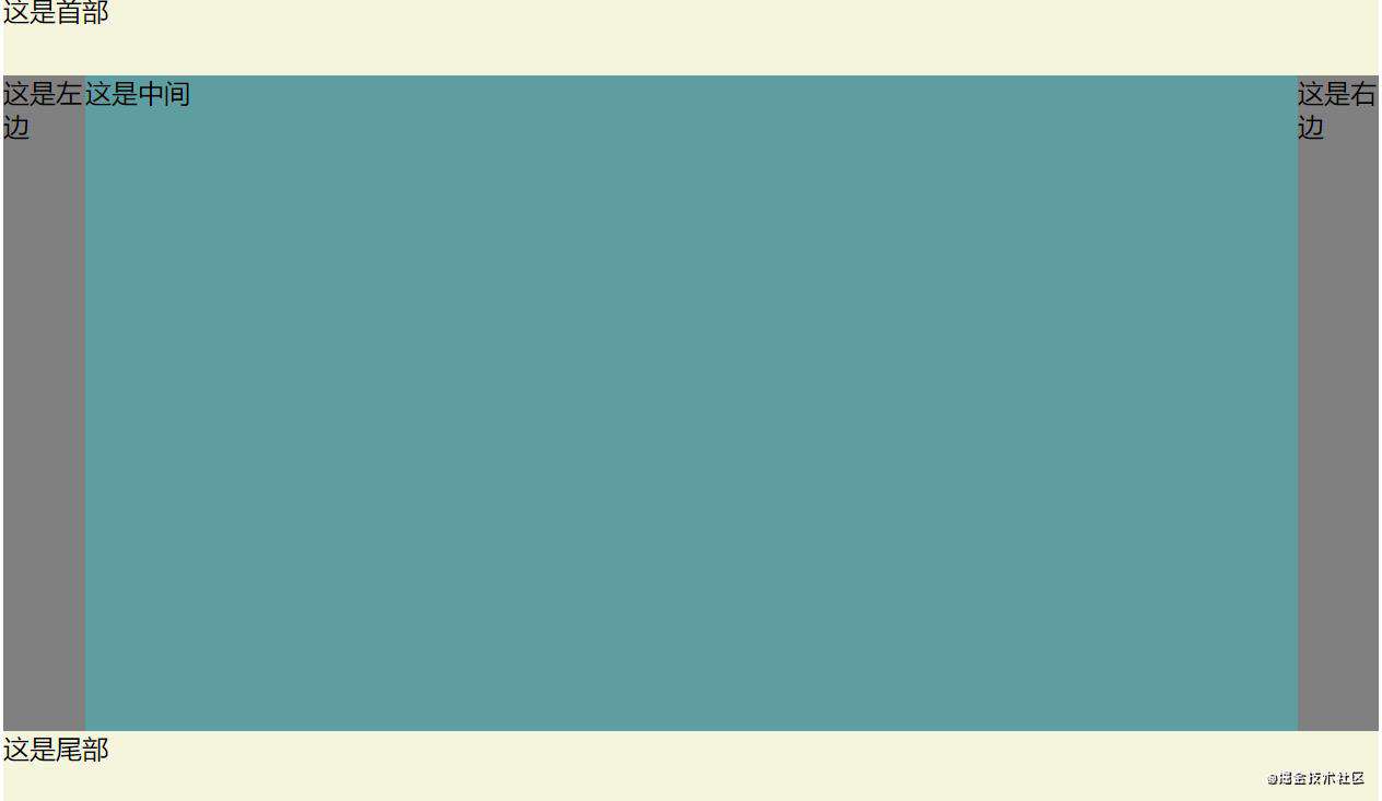
- 父元素开启flex布局,middle设置flex:1
<!DOCTYPE html>
<html>
    <title></title>
    <style>
        header,footer{
            width:100%;
            height:50px;
            background-color: beige;
        }
        .container{
            width:100%;
            display:flex;/*flex布局*/
        }
        .middle{
            flex:1;
            height:400px;
            background-color: cadetblue;
        }
        .left{
            width:50px;
            height:400px;
            background-color: gray;
        }
        .right{
            width:50px;
            height:400px;
            background-color: gray;
        }

    </style>
    <body>
        <header>这是首部</header>
        <div class="container">
            <div class="left">这是左边</div>
            <div class="middle">这是中间</div>
            <div class="right">这是右边</div>
        </div>
        <footer>这是尾部</footer>
    </body>
</html>
圣杯布局(中间栏要最先开始渲染)
注意:(浮动 负边距 内边距 定位)
- 结构上,需要在三栏外包一层container
- css中 首先在最外层加上伪元素清除浮动,设置padding
- middle left right都左浮动,middle宽度100% 其他两个定宽
- left marign-left:-100%, 然后设置相对定位 左移自己的宽度。
- right margin-left:-自己的宽度,然后设置相对定位,右移自己的宽度
<!DOCTYPE html>
<html>
    <title></title>
    <style>
        header,footer{
            width:100%;
            height:50px;
            background-color: beige;
        }
        .container{
            padding: 0 50px;/*防止左边那栏超出页面*/
        }
        /*三个都左浮动*/
        .middle{
            float:left;
            width:100%;/*中间自适应宽度*/
            height:400px;
            background-color: cadetblue;
        }
        .left{
            float:left;
            width:50px;
            height:400px;
            background-color: gray;

            margin-left: -100%;/*移到最左边*/
            position:relative;/*向左移动 防止挡住middle*/
            left:-50px;
        }
        .right{
            float:left;
            width:50px;
            height:400px;
            background-color: gray;

            margin-left:-50px;/*移动自己的宽度就行*/
            position:relative;
            right:-50px;
        }
        .clearfix::after{
            display:block;/*清除浮动*/
            content:"";
            clear:both;

        }
    </style>
    <body>
        <header>这是首部</header>
        <div class="container clearfix">
            <div class="middle">这是中间</div>
            <div class="left">这是左边</div>
            <div class="right">这是右边</div>
        </div>
        <footer>这是尾部</footer>
    </body>
</html>
双飞翼布局(浮动 负边距 边距)
注意:
- 整体布局是在middle外包一层container,然后给container left right设置左浮动
- container设置100%宽度,left,right定宽(左外边距同上)。
- 为了防止middle被左右遮住,设置margin: 0 50px;
- 清除浮动加在footer
<!DOCTYPE html>
<html>
    <title></title>
    <style>
        header,footer{
            width:100%;
            height:50px;
            background-color: beige;
        }
        .container{
            float:left;
            width:100%;/*中间自适应宽度*/
        }
        /*三个都左浮动*/
        .middle{
            height:400px;
            margin: 0 50px;/*防止被挡住*/
            background-color: cadetblue;
        }
        .left{
            float:left;
            width:50px;
            height:400px;
            background-color: gray;

            margin-left: -100%;/*移到最左边*/

        }
        .right{
            float:left;
            width:50px;
            height:400px;
            background-color: gray;

            margin-left:-50px;/*移动自己的宽度就行*/

        }
        footer{
            clear:both;/*清除浮动*/
        }
    </style>
    <body>
        <header>这是首部</header>
        <div class="container">
            <div class="middle">这是中间</div>
        </div>
        <div class="left">这是左边</div>
        <div class="right">这是右边</div>
        <footer>这是尾部</footer>
    </body>
</html>
等高布局
居中的方法
水平居中
正常文档流的水平居中(设置width 和 margin)
        .box{
            width:100px;
            height:100px;
            margin: 0 auto;
            background-color: black;
        }
绝对定位的元素水平居中(设置 width margin left right)
        .box{
            position:absolute;
            width:100px;
            height:100px;
            margin:auto;
            left:0;
            right:0;
            background-color: black;
        }
垂直居中
已知元素的高度:绝对定位 + top + margin
        .box{
            position:absolute;//绝对定位
            width:100px;
            height:100px;
            top: 50%;//距离父元素顶部50%
            left:50%;
            margin:-50px 0 0 -50px;//再向上移一半的高度
            background-color: black;
        }
未知元素高度:绝对定位 + top+ transform
        .box{
            position:absolute;
            width:100px;
            height:100px;
            top: 50%;
            left:50%;
            transform:translate(-50%,-50%);
            background-color: black;
        }
flex
        .container{
            height:500px;
            display:flex;
            align-items:center;//垂直居中
            justify-content:center;//水平居中
        }
        .box{
            width:100px;
            height:100px;
            background-color: black;
        }
文本垂直居中(line-height)和水平居中(text-align)
        .box{
            width:100px;
            height:100px;
            text-align:center;
            line-height:100px;
            background-color: black;
            color:white;
        }
line-height + vertical-align(图片)
BFC(块格式化上下文)
形成一个独立的渲染区域,让这里的元素不会受外界影响。
BFC的触发条件
1.根元素(html),一个根元素本身就是一个BFC区域。
2.float不为none
3.overflow 不为 visible
4.position 不为static 或者 relative
5.display 为inline-block、table-cell、table-caption,flex。
BFC的特性
1.BFC内部,盒子由上至下按顺序排列,间隙由盒子的外边距决定。并且同一个BFC内的两个相邻盒子具有相对方向的外边距时,外边距会发生折叠。
2.BFC内部无论是浮动盒子还是普通盒子,其左都和包含块的左边接触。
3.BFC区域不会和float区域相叠加。
4.BFC内外布局不会互相影响。
5.计算BFC高度的时候会把浮动元素的高度叶计算在内。
可以解决问题
juejin.cn/post/684490…
浮动覆盖问题
如果一个浮动元素后面跟着一个非浮动的元素,那么就会产生一个覆盖的现象,很多自适应的两栏布局就是这么做的。
<style>
    body {
        width: 300px;
        position: relative;
    }

    .aside {
        width: 100px;
        height: 150px;
        float: left;
        background: #f66;
    }

    .main {
        height: 200px;
        background: #fcc;
    }
</style>
<body>
    <div class="aside"></div>
    <div class="main"></div>
</body>
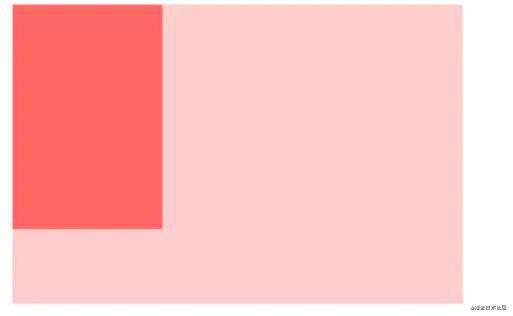
.aside和.mian重叠了。试分析一下,由于两个box都处在同一个BFC中,都是以BFC边界为起点,如果两个box本身都具备BFC的话,会按顺序一个一个排列布局,现在.main并不具备BFC,根据BFC特性2:每个元素的margin box的左边, 与包含块border box的左边相接触。即使存在浮动也是如此。
虽然存在浮动的元素aslide,但main的左边依然会与包含块的左边相接触
根据BFC第3条特性:BFC的区域不会与float box重叠
我们可以通过通过触发main生成BFC, 来实现自适应两栏布局。
.main {
    overflow: hidden;
浮动使父元素高度塌陷问题
子元素浮动脱离标准流,而父元素没有设置高度,就会使父容器高度无法被撑开。
    <style>
        *{
            margin:0;
            padding:0;
        }
        .container{
            background-color: brown;/*高度仅被p撑开*/
        }
        .container img{
            float:left;/*左浮动脱离文档流*/
            width:200px;
        }
    </style>
</head>
<body>
    <div class="container">
        <img src="C:/Users/86188/Desktop/222.png"/>
        <p>这是一段文字</p>
    </div>
 解决方法:
解决方法:
1.在父元素的最后增加一个空标签,设置样式clear:both。这样书写比较方便,但是增加了无意义的标签,结构化差。
    <style>
        *{
            margin:0;
            padding:0;
        }
        .container{
            background-color: brown;/*高度仅被p撑开*/
        }
        .container img{
            float:left;/*左浮动脱离文档流*/
            width:200px;
        }
        .container .clear{
            clear:both;
        }
    </style>
</head>
<body>
    <div class="container">
        <img src="C:/Users/86188/Desktop/222.png"/>
        <p>这是一段文字</p>
        <p class = "clear"></p>
    </div>
2.给父元素overflow:hidden,开启BFC。代码简洁,但是会使子元素不自动换行,从而隐藏掉被溢出的元素。
        .bfc{
            overflow: hidden;/*溢出的部分隐藏  开启bfc*/
        }
3.给父元素增加伪元素::after。
   <style>
        *{
            margin:0;
            padding:0;
        }
        .container{
            background-color: brown;/*高度仅被p撑开*/
        }
        .container img{
            float:left;/*左浮动脱离文档流*/
            width:200px;
        }
        .container::after{
            content:"";
            clear:both;
            display:block;
        }

    </style>
</head>
<body>
    <div class="container">
        <img src="C:/Users/86188/Desktop/222.png"/>
        <p>这是一段文字</p>
    </div>
margin 折叠问题
兄弟元素折叠:box1的下边距和box2的上边距合并,使得两个Box之间的距离是较大的那个。
  <style>
        *{
            margin:0;
            padding:0;
        }
        .box{
            background-color: bisque;
            margin-top:10px;
            margin-bottom: 20px;
        }

    </style>
</head>
<body>
    <div class="container">
        <div class="box">hi,这是box1</div>
        <div class="box">hi,这是box2</div>
    </div>

</body>
解决方法是对不需要合并外边距的那个元素加一个父元素,然后开启BFC,这样这个元素和其他元素不在同一个BFC内,就不会外边距合并。
父子元素折叠子元素的margin-top会传给父元素,然后父元素的margin-top是子元素和父元素中的最大值,而子元素相对父元素是不动的。
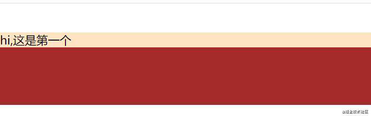
    <style>
        *{
            margin:0;
            padding:0;
        }
        .container{
            height:100px;
            background-color: brown;
        }
        .box{
            background-color: bisque;
            margin-top:40px;
            margin-bottom: 20px;
        }

    </style>
</head>
<body>
    <div class="container">
        <div class="box">hi,这是第一个</div>
    </div>
解决方法父元素开启BFC,这样BFC内部的布局就不会影响外部的布局。
   <style>
        *{
            margin:0;
            padding:0;
        }
        .container{
            height:100px;
            background-color: brown;
        }
        .box{
            background-color: bisque;
            margin-top:40px;
            margin-bottom: 20px;
        }
        .bfc{
            overflow: hidden;
        }
    </style>
</head>
<body>
    <div class="container bfc">
        <div class="box">hi,这是第一个</div>
    </div>
也可以使用伪元素在父元素前加一个空白元素,使子元素不是第一个。
        .container::before{
            content:"";
            display: table;
        }
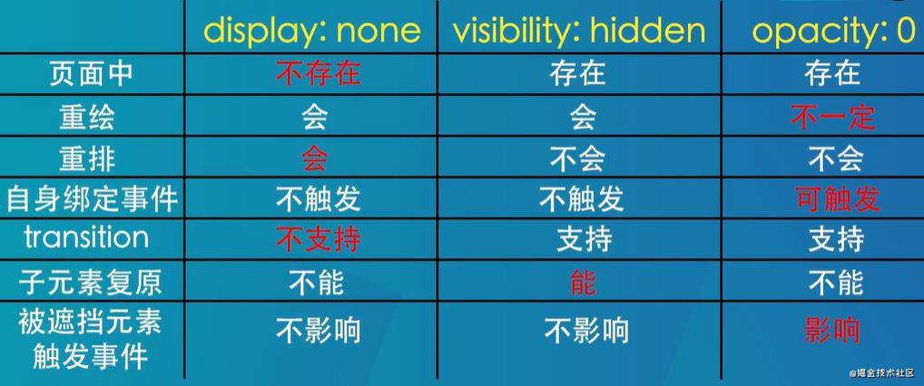
元素隐藏方法
什么是响应式设计?响应式设计的基本原理是什么?如何兼容低版本的IE?
响应式网站设计(Responsive Web design)是一个网站能够兼容多个终端,而不是为每一个终端做一个特定的版本。 基本原理是通过媒体查询检测不同的设备屏幕尺寸做处理。 页面头部必须有meta声明的viewport。
<meta name=’viewport’ content=”width=device-width, initial-scale=1. maximum-scale=1,user-scalable=no”>
CSS的百分比
按百分比设定一个元素的宽度时,它是相对于父容器的宽度计算的。
但是,对于一些表示竖向距离的属性,例如 padding-top , padding-bottom , margin-top , margin-bottom 等,当按百分比设定它们时,依据的也是父容器的宽度,而不是高度。
浏览器如何解析CSS选择器
CSS选择器的解析是从右向左解析的。
若从左向右的匹配,发现不符合规则,需要进行回溯,会损失很多性能。
若从右向左匹配,先找到所有的最右节点,对于每一个节点,向上寻找其父节点直到找到根元素或满足条件的匹配规则,则结束这个分支的遍历。
两种匹配规则的性能差别很大,是因为从右向左的匹配在第一步就筛选掉了大量的不符合条件的最右节点(叶子节点),而从左向右的匹配规则的性能都浪费在了失败的查找上面。
而在 CSS 解析完毕后,需要将解析的结果与 DOM Tree 的内容一起进行分析建立一棵 Render Tree,最终用来进行绘图。
在建立 Render Tree 时(WebKit 中的「Attachment」过程),浏览器就要为每个 DOM Tree 中的元素根据 CSS 的解析结果(Style Rules)来确定生成怎样的 Render Tree。
style标签写在body后与body前有什么区别?
页面加载自上而下 当然是先加载样式。 写在body标签后由于浏览器以逐行方式对HTML文档进行解析,当解析到写在尾部的样式表(外联或写在style标签)会导致浏览器停止之前的渲染,等待加载且解析样式表完成之后重新渲染,在windows的IE下可能会出现FOUC现象(即样式失效导致的页面闪烁问题)
CSS选择符有哪些,哪些属性可以继承
- id选择器(#myId)
- 类选择器(.myClass)
- 标签选择器(p div h1)
- 相邻选择器 (h1 + p)
- 子选择器(ul > li)
- 后代选择器 (li a)
- 通配符选择器 (*)
- 属性选择器(a[rel = 'external'])
- 伪类选择器(a:hover, li:nth-child)
可以继承的属性:font-family、font-size、color 不能继承的属性:border margin padding width height
CSS优先级计算
元素选择器 div,input,span:1
class选择器 .box,.content: 10
id选择器 #box,#content: 100
一些规则:
- 优先级可以叠加计算
- 优先级相同的,选择最后出现的样式
- 继承得来的优先级最低
CSS的伪类和伪元素
伪类和伪元素的区别:伪元素(::)会创建新的对象,而伪类只会选择已经存在的对象。
::before 和 :after中双冒号和单冒号有什么区别?解释一下这2个伪元素的作用。
单冒号(:)用于CSS3伪类,双冒号(::)用于CSS3伪元素。
::before就是以一个子元素的存在,定义在元素主体内容之前的一个伪元素。并不存在于dom之中,只存在在页面之中。
:before 和 :after 这两个伪元素,是在CSS2.1里新出现的。起初,伪元素的前缀使用的是单冒号语法,但随着Web的进化,在CSS3的规范里,伪元素的语法被修改成使用双冒号,成为::before ::after
CSS预处理器
less,sass(scss)
CSS预处理是一种将CSS作为目标生成文件的,使用变量、函数及其简单的逻辑实现更加简洁、适应性更强、可读性更好、更加易于代码维护的兼容浏览器的页面样式文件。
它扩充了 CSS 语言,增加了诸如变量、混合、函数等功能,让 CSS 更易维护、 方便制作主题、扩充。
常见属性
position
absolute
生成绝对定位的元素,相对于值不为 static的第一个父元素进行定位。
fixed (老IE不支持)
生成绝对定位的元素,相对于浏览器窗口进行定位。
relative
生成相对定位的元素,相对于其正常位置进行定位。
static
默认值。没有定位,元素出现在正常的流中(忽略 top, bottom, left, right z-index 声明)。
inherit
规定从父元素继承 position 属性的值。- static(默认)->按正常文档流进行排列
overflow
hidden:溢出的部分隐藏
scroll:出现滚动条
visiblity:默认正常显示
auto:溢出时出现滚动条。
display
block       	块类型。默认宽度为父元素宽度,可设置宽高,换行显示。
none        	元素不显示,并从文档流中移除。
inline      	行内元素类型。默认宽度为内容宽度,不可设置宽高,同行显示。
inline-block  默认宽度为内容宽度,可以设置宽高,同行显示。
list-item   	像块类型元素一样显示,并添加样式列表标记。
table       	此元素会作为块级表格来显示。
inherit     	规定应该从父元素继承 display 属性的值。
CSS3新特性
 新增各种CSS选择器	(: not(.input):所有 class 不是“input”的节点)
    圆角		    (border-radius:8px)
    多列布局	    (multi-column layout)
    文字特效		(text-shadow、)
    线性渐变		(gradient)
    旋转		 	(transform)
    缩放,定位,倾斜,动画,多背景
    例如:transform:\scale(0.85,0.90)\ translate(0px,-30px)\ skew(-9deg,0deg)\Animation:
px em rem
'rem'是'css3'新增的一个相对长度单位,它的出现是为了解决em的缺点,em可以说是相对于父级元素的字体大小,当父级元素字体大小改变时,又得重新计算。rem出现就可以解决这样的问题,rem只相对于根目录,即HTML元素。有了rem这个单位,我们只需要调整根元素html的font-size就能达到所有元素的动态适配了.

逻辑像素(css的px) = 设备像素 × 缩放因子
为了移动端更好的适配我们引入了em和rem这2个动态单位
em的大小与父元素的font-size有关,
rem的大小与根元素html的font-size有关
一般在移动端我们会使用js动态计算跟节点html的font-size来达到自适应的目的。
链接:https://juejin.cn/post/6844904167719305229
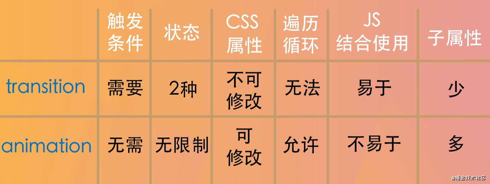
动画和过渡
手写题
CSS创建一个三角形
 当把上图中的content部分设为0,那么div就是由四个三角形(边框宽度不等时会出现四边形)组成的。只显示一个三角形,可以把上左右边框设为透明
        .box{
            width:0;
            height:0;
            border:100px solid transparent;
            border-bottom-color: black;
        }
一个等边三角形
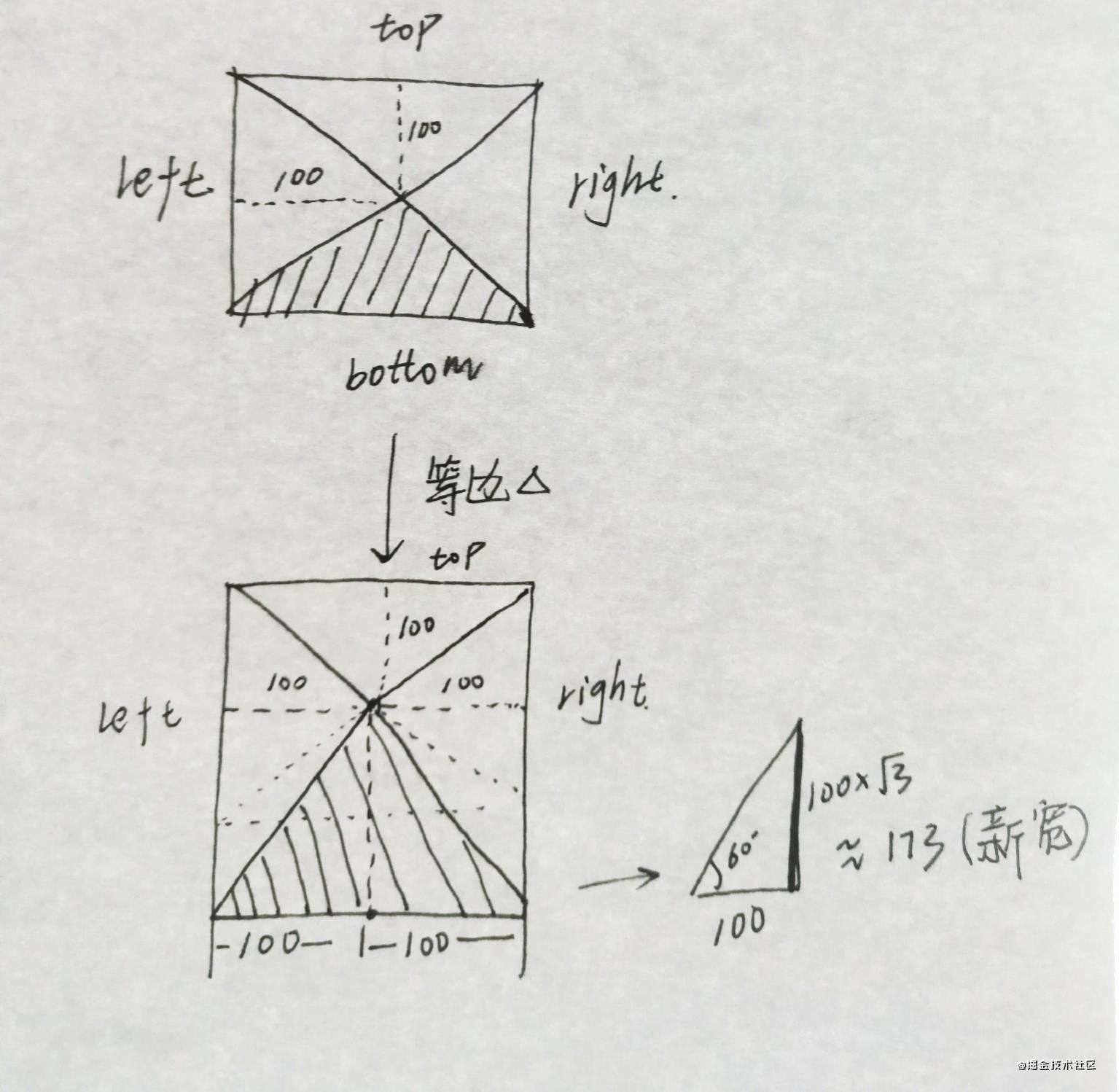
        .box{
            width:0;
            height:0;
            border:100px solid transparent;
            border-bottom: 173px solid black;
        }
一个直角三角形
把中间的节点拉到右上角,即把top和right设为0。
        .box{
            width:0;
            height:0;
            border-left:100px solid transparent;
            border-bottom:100px solid black;
        }
溢出文本变成...
    .left{
        width:50px;
        overflow:hidden;
        text-overflow: ellipsis;/*替换成省略号*/
        white-space: nowrap;/*强制不换行*/
    }
常见问题FAQ
- 免费下载或者VIP会员专享资源能否直接商用?
- 本站所有资源版权均属于原作者所有,这里所提供资源均只能用于参考学习用,请勿直接商用。若由于商用引起版权纠纷,一切责任均由使用者承担。更多说明请参考 VIP介绍。
- 提示下载完但解压或打开不了?
- 找不到素材资源介绍文章里的示例图片?
- 模板不会安装或需要功能定制以及二次开发?


发表评论
还没有评论,快来抢沙发吧!