前言
为了按照常规WEB布局,这里全部采用拥有header和footer模式进行左中右布局编写。
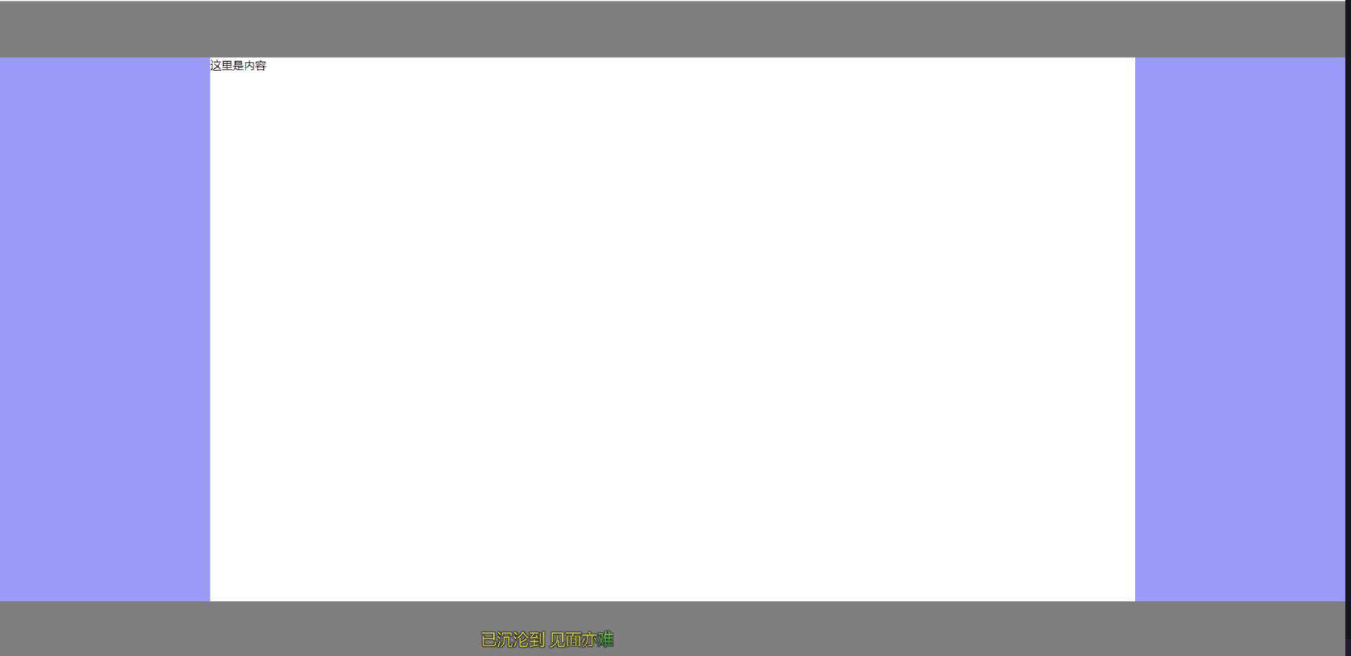
第一种:基于float实现
实现思路
常规思路,使左右两个Aside分别浮动至左右两侧即可
代码实现
<!-- HTML部分 -->
<div class="container">
  <!-- 顶部Header -->
  <header>这里是头部</header>
  <!-- 中间aside及content -->
  <div class="middle clearfix">
    <aside class="left"></aside>
    <aside class="right"></aside>
    <!-- 中间content显示内容 为了防止将右侧挤下去故放置在右侧栏下方 -->
    <div class="content">这里是内容</div>
  </div>
  <!-- 底部Footer -->
  <footer></footer>
</div>
<!-- CSS部分 -->
<style lang="scss">
  * {
    margin: 0;
    padding: 0;
  }

  .clearfix {
    zoom: 1;
    &::after {
      display: block;
      content: ' ';
      clear:both
    }
  }

  html, body {
    width: 100%;
    height: 100%
    }
    .container {
      width: 100%
      height: 100%
      header {
        height: 80px;
        background: rgba(0, 0, 0, 0.5)
      }
      footer {
        height: 80px;
        background: rgba(0, 0, 0, 0.5)
      }
      .middle {
        height: calc(100% - 80px - 80px)
        aside {
          height: 100%;
          width: 300px;
          background: rgba(156, 154, 249, 1)
        }
        .left {
          float: left
        }
        .right: {
          float: right
        }
      }
    }
  }
</style>
实现效果
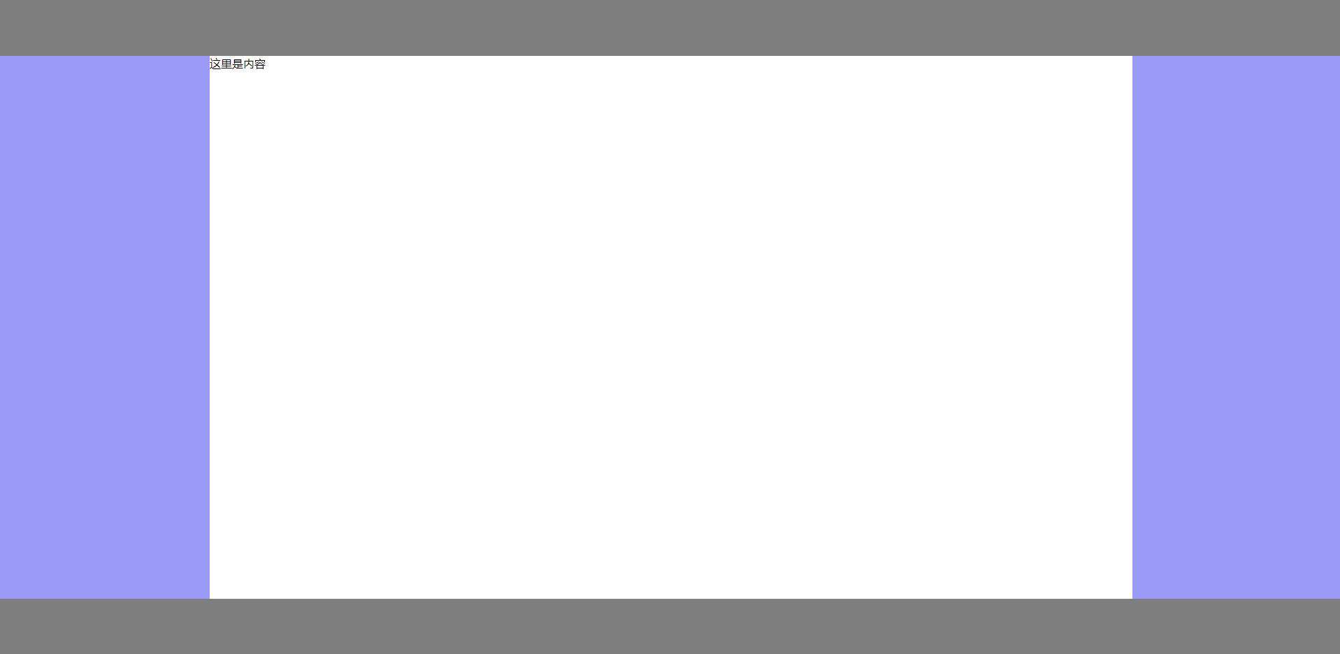
第二种:基于position:absolute实现
实现思路
为中间三栏父级赋予position: relative,赋予左右Aside position: absolute,并且分别赋予left: 0 right: 0 width:自定义值,赋予中间content left,right 分别等于左右width即可
代码实现
<!-- HTML相关代码 -->
<div class="container">
  <!-- 顶部Header -->
  <header></header>
  <div class="middle">
    <!-- 左侧Aside -->
    <aside class="left"></aside>
    <!-- 中间content内容 -->
    <div class="content">这里是内容</div>
    <!-- 右侧Aside -->
    <aside class="right"></aside>
  </div>
  <!-- 底部Footer -->
  <footer></footer>
</div>
<!-- CSS相关代码 -->
<style lang="scss">
  * {
    margin: 0;
    padding: 0
  }

  html, body {
    width: 100%;
    height: 100%
  }

  .container {
    width: 100%;
    height: 100%;
    header {
      height: 80px;
      background: rgba(0, 0, 0, 0.5);
    }
    footer {
      height: 80px;
      background: rgba(0, 0, 0, 0.5);
    }
    .middle {
      height: calc(100% - 80px - 80px);
      position: relative;
      aside,
      .content {
        position: absolute;
      }
      .left {
        width: 300px;
        background: rgba(156, 154, 249, 1);
        left: 0;
        height: 100%;
      }
      .right {
        width: 300px;
        background: rgba(156, 154, 249, 1);
        right: 0;
        height: 100%;
      }
      .content {
        left: 300px;
        right: 300px;
      }
    }
  }
</style>
实现效果

第三种:基于display:flex实现
实现思路
赋予左中右三列父级display: flex,赋予左右Aside width自定义,赋予中间content flex:1即可
代码实现
<!-- HTML相关代码 -->
<div class="container">
  <!-- 顶部Header -->
  <header></header>
  <div class="middle">
    <!-- 左侧Aside -->
    <aside class="left"></aside>
    <!-- 中间content内容 -->
    <div class="content">这里是内容</div>
    <!-- 右侧Aside -->
    <aside class="right"></aside>
  </div>
  <!-- 底部Footer -->
  <footer></footer>
</div>
<!-- CSS部分 -->
<style lang="scss">
  * {
    margin: 0;
    padding: 0;
  }

  html, body {
    width: 100%;
    height: 100%;
  }

  .container {
    header {
      height: 80px;
      background: rgba(0, 0, 0, 0.5);
    }
    footer {
      height: 80px;
      background: rgba(0, 0, 0, 0.5);
    }
    .middle {
      display: flex;
      height: calc(100% - 80px - 80px);
      aside {
        width: 300px;
        background: rgba(156, 154, 249, 1);
      }
      .content: {
        flex: 1;
      }
    }
  }
</style>
实现效果

第四种:基于display: table实现
实现思路
赋予左中右三列父级display: table, width: 100%,分别赋予左中右三列display: table-cell,分别赋予左右Aside width即可。
代码实现
<!-- HTML相关代码 -->
<div class="container">
  <!-- 顶部Header -->
  <header></header>
  <div class="middle">
    <!-- 左侧Aside -->
    <aside class="left"></aside>
    <!-- 中间content内容 -->
    <div class="content">这里是内容</div>
    <!-- 右侧Aside -->
    <aside class="right"></aside>
  </div>
  <!-- 底部Footer -->
  <footer></footer>
</div>
<!-- CSS部分 -->
<style lang="scss">
  * {
    margin: 0;
    padding: 0;
  }

  html, body {
    width: 100%;
    height: 100%;
  }

  .container {
    header {
      height: 80px;
      background: rgba(0, 0, 0, 0.5);
    }
    footer {
      height: 80px;
      background: rgba(0, 0, 0, 0.5);
    }
    .middle {
      display: table;
      width: 100%
      height: calc(100% - 80px - 80px);
      aside {
        width: 300px;
        display: table-cell;
        background: rgba(156, 154, 249, 1);
      }
      .content: {
        display: table-cell;
      }
    }
  }
</style>
实现效果

第五种:基于display: grid实现
实现思路
赋予左中右三列父级display: grid,并且使用grid-template-columns: 300px auto 300px,将其分为宽为300px、auto、300px三列布局即可。
代码实现
<!-- HTML相关代码 -->
<div class="container">
  <!-- 顶部Header -->
  <header></header>
  <div class="middle">
    <!-- 左侧Aside -->
    <aside class="left"></aside>
    <!-- 中间content内容 -->
    <div class="content">这里是内容</div>
    <!-- 右侧Aside -->
    <aside class="right"></aside>
  </div>
  <!-- 底部Footer -->
  <footer></footer>
</div>
<!-- CSS部分 -->
<style lang="scss">
  * {
    margin: 0;
    padding: 0;
  }

  html, body {
    width: 100%;
    height: 100%;
  }

  .container {
    header {
      height: 80px;
      background: rgba(0, 0, 0, 0.5);
    }
    footer {
      height: 80px;
      background: rgba(0, 0, 0, 0.5);
    }
    .middle {
      display: grid;
      grid-template-columns: 300px auto 300px;
      height: calc(100% - 80px - 80px);
      aside {
        background: rgba(156, 154, 249, 1);
      }
    }
  }
</style>
实现效果
常见问题FAQ
- 免费下载或者VIP会员专享资源能否直接商用?
- 本站所有资源版权均属于原作者所有,这里所提供资源均只能用于参考学习用,请勿直接商用。若由于商用引起版权纠纷,一切责任均由使用者承担。更多说明请参考 VIP介绍。
- 提示下载完但解压或打开不了?
- 找不到素材资源介绍文章里的示例图片?
- 模板不会安装或需要功能定制以及二次开发?


发表评论
还没有评论,快来抢沙发吧!