作者 | 弗拉德
来源 | 弗拉德(公众号:fulade_me)
BottomNavigationBar
BottomNavigationBar 和 BottomNavigationBarItem 配合来共同展示Flutter里面的底部状态栏,底部状态栏是在移动端很重要的控件。
先看一下 BottomNavigationBar构造方法
BottomNavigationBar({
    // key
    Key key,
    /// BottomNavigationBarItem 数组
    @required this.items,
    /// 点击事件方法
    this.onTap,
    /// 当前选中的 元素下标
    this.currentIndex = 0,
    ///  底部导航栏的Z坐标
    this.elevation,
    /// 默认是 BottomNavigationBarType.shifting 一般我们使用 BottomNavigationBarType.fixed
    this.type,
    /// 选中项目颜色的值
    Color fixedColor,
    /// 背景颜色
    this.backgroundColor,
    /// BottomNavigationBarItem图标的大小
    this.iconSize = 24.0,
    /// 选中时图标和文字的颜色
    Color selectedItemColor,
    /// 未选中时图标和文字的颜色
    this.unselectedItemColor,
    // 选中时的子Item的样式
    this.selectedIconTheme,
    /// 未选中时的子Item的样式
    this.unselectedIconTheme,
    // 选中时字体大小
    this.selectedFontSize = 14.0,
    /// 未选中时的字体大小
    this.unselectedFontSize = 12.0,
    /// 选中的时候的字体样式
    this.selectedLabelStyle,
    /// 未选中时的字体样式
    this.unselectedLabelStyle,
    /// 是否为未选择的BottomNavigationBarItem显示标签
    this.showSelectedLabels = true,
    //// 是否为选定的BottomNavigationBarItem显示标签
    this.showUnselectedLabels,
    /// pc端或web端使用
    this.mouseCursor,
})
我们来做一个点击底部状态栏按钮切换颜色的Demo
class _BottomNavigationBarDemoPageState
    extends State<BottomNavigationBarDemoPage> {
  int selectedIndex = 0;
  List<Container> containerList = [
    Container(
      color: Colors.red,
    ),
    Container(
      color: Colors.blue,
    ),
    Container(
      color: Colors.yellow,
    ),
    Container(
      color: Colors.green,
    )
  ];
  @override
  Widget build(BuildContext context) {
    return Scaffold(
      appBar: AppBar(
        centerTitle: true,
        title: Text("BottomNavigationBarDemo"),
        backgroundColor: Colors.blue,
      ),
      body: containerList[selectedIndex],
      bottomNavigationBar: BottomNavigationBar(
        /// 这个很重要
        type: BottomNavigationBarType.fixed,
        currentIndex: selectedIndex,
        onTap: (index) {
          setState(() {
            selectedIndex = index;
          });
        },
        items: <BottomNavigationBarItem>[
          BottomNavigationBarItem(
            title: Text('F1'),
            icon: Icon(Icons.home),
          ),
          BottomNavigationBarItem(
            title: Text('F2'),
            icon: Icon(Icons.book),
          ),
          BottomNavigationBarItem(
            title: Text('F3'),
            icon: Icon(Icons.school),
          ),
          BottomNavigationBarItem(
            title: Text('F4'),
            icon: Icon(Icons.perm_identity),
          ),
        ],
      ),
    );
  }
}
-
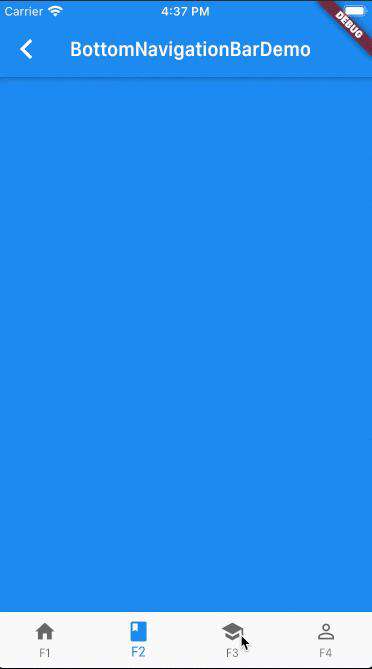
Scaffold接收一个BottomNavigationBar作为bottomNavigationBar的参数,然后BottomNavigationBar接收一个items的数组,这个数组里面传入了4个BottomNavigationBarItem对象分别命名为F1、F2、F3、F4 -
type参数传入的是BottomNavigationBarType.fixed,默认是BottomNavigationBarType.shifting,默认的效果是 只有在选中BottomNavigationBarItem时才会显示文字。设置成BottomNavigationBarType.fixed非选中状态下也会显示文字和图标 -
onTap实现的是一个方法,参数是被点击的当前BottomNavigationBarItem的下标,在这里被点击后调用setState来刷新页面的颜色
效果如下:
日常开发中以上效果基本能满足大多数需求 如果想要自定义下面Icon的样式,可以使用 BottomAppBar
这里也介绍两个不错的库
-
tab_bar_animation
链接: github.com/tunitowen/t… 效果如下:
- simpleanimations 链接: github.com/TechieBloss… 效果如下:
想体验以上的示例的运行效果,可以到我的Github仓库项目flutter_app->lib->routes->bottom_navigation_page.dart查看,并且可以下载下来运行并体验。
常见问题FAQ
- 免费下载或者VIP会员专享资源能否直接商用?
- 本站所有资源版权均属于原作者所有,这里所提供资源均只能用于参考学习用,请勿直接商用。若由于商用引起版权纠纷,一切责任均由使用者承担。更多说明请参考 VIP介绍。
- 提示下载完但解压或打开不了?
- 找不到素材资源介绍文章里的示例图片?
- 模板不会安装或需要功能定制以及二次开发?


发表评论
还没有评论,快来抢沙发吧!