Flutter 基础控件 Button Widget
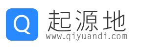
BackButton
- BackButton是一个material风格的返回按钮,本身是一个IconButton,点击时默认执行Navigator.maybePop即如果路由栈有上一页则返回到上一页。
BackButton(color: Colors.orange),
CloseButton
- CloseButton是一个material风格的关闭按钮,本身是一个IconButton,点击时默认执行Navigator.maybePop即如果路由栈有上一页则返回到上一页。
CloseButton()
FlatButton
- FlatButton :扁平化的按钮,继承自MaterialButton
- semanticsLabel 相当于tips 控件描述
 ButtonBar(
    children: <Widget>[
      FlatButton(
        onPressed: () {},
        child: Text(
          "FlatButton",
          semanticsLabel: "FlatButton 1",
        ),
      ),
      FlatButton(
        onPressed: () {},
        child: Text(
          "Disabled",
          semanticsLabel: "DisableButton 2",
        ),
      )
    ],
  ),
FlatButton.icon
- 带图标
  FlatButton.icon(
      onPressed: null,
      icon: const Icon(Icons.add_circle_outline, size: 18),
      label: const Text(
        "FlatButton",
        semanticsLabel: 'FlatButton 3',
      )),
  FlatButton.icon(
      onPressed: null,
      icon: const Icon(Icons.add_circle_outline_sharp, size: 18),
      label: const Text(
        "Disabled 2",
        semanticsLabel: 'DisableButton 4',
      )),
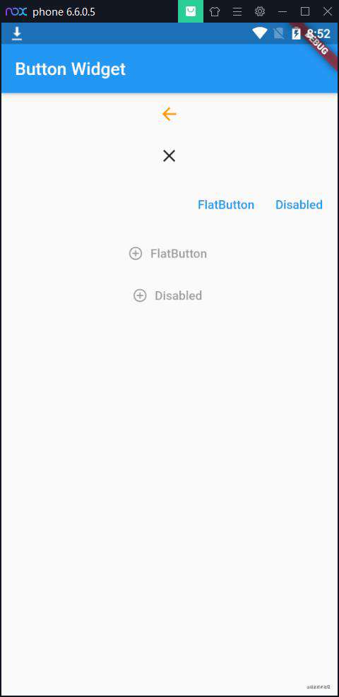
OutlineButton
- OutlineButton :带边框的按钮,继承自MaterialButton
 OutlineButton(
    onPressed: () {},
    child: Text('data'),
  ),
OutlineButton.icon
  OutlineButton.icon(
      onPressed: null,
      icon: Icon(Icons.add, size: 25),
      label: Text(
        "Outline Button",
        semanticsLabel: "Outline Button 1",
      )),
  OutlineButton.icon(
    disabledTextColor: Colors.orange,
      onPressed: null,
      icon: Icon(Icons.add, size: 25),
      label: Text(
        "Disable Button",
        semanticsLabel: "Disable Button 2",
      )),
RaisedButton
- 继承自MaterialButton,所以MaterialButton中的大多数属性这边都能用,且效果一致
  (
    onPressed: null,
    child: Text("Raise Button"),
  ),
  RaisedButton(
    disabledTextColor: Colors.tealAccent,
    onPressed: null,
    child: Text("Disabled Button"),
  ),
RaisedButton.icon
- 带图标
  RaisedButton.icon(
    onPressed: null,
    icon: const Icon(
      Icons.add_circle,
      size: 18,
    ),
    label: Text("Raise Button"),
  ),
  RaisedButton.icon(
    disabledTextColor: Colors.amber,
    icon: const Icon(
      Icons.add_alarm,
      size: 18,
    ),
    onPressed: null,
    label: Text("Disabled Button"),
  ),
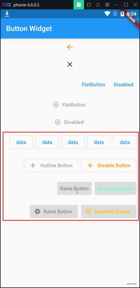
MaterialButton
- onPressed: 按下之后松开的回调,也就是所谓的点击事件。其实是当用户手抬起来时的动作
- onHighlightChanged: onPressed!=null 的时候可以看出 相当于用户按下时(高亮) 或者 松开时(不高亮)的监听。
- textColor: 里面文本的颜色
- disabledTextColor: 当状态为 disable的时候 文本的颜色,onpress=null 为disable
注意点 在这里无效 在它子类有效(RaisedButton ,FlatButton ,OutlineButton )
- color: // 当是 enable (onpress != null) 背景色
- disabledColor: //onpress = null 的时候的颜色(不知道为什么测试不管用)
注意点 在这里无效 在它子类有效(RaisedButton ,FlatButton ,OutlineButton )
- highlightColor: 当用户 按下高亮时 的颜色
- elevation: Z轴阴影 默认是2 ,当 enable 的时候的阴影
- highlightElevation: 高亮时的阴影 默认是 8 button 被按下的时候
- disabledElevation: 当 disabled (onpress = null) 的阴影 默认是0 ,测试的时候 阴影还是 为0.0,也就是说不管用
注意点 在这里无效 在它子类有效(RaisedButton ,FlatButton ,OutlineButton )
- minWidth: 最小的宽度 默认是 88 。 在 ButtonTheme 规定的
- height: 高度, 默认是 36 也是在 ButtonTheme 规定的
- child: 包括的子控件
- shape 边框样式
注意点 在这里无效 在它子类有效(RaisedButton ,FlatButton ,OutlineButton )
  MaterialButton(
    onPressed: null,
    child: Text("MaterialButton"),
  ),
  MaterialButton(
    onPressed: null,
    child: Text("MaterialButton2"),
  ),
RawMaterialButton
- onPressed 点击回调
- onHighlightChanged 高亮变化回调
- textStyle 字体样式
- fillColor 背景填充颜色
- highlightColor 高亮颜色
- splashColor 水波纹颜色
- elevation 阴影Z轴值
- highlightElevation 高亮 阴影Z轴值
- disabledElevation 禁用阴影Z轴值
- padding padding
- constraints 按钮大小,一般设置最小size
- shape 按钮形状
    children: <Widget>[
      RawMaterialButton(
        onPressed: null,
        child: Text("RawMaterialButton"),
      ),
      RawMaterialButton(
        onPressed: null,
        child: Text("RawMaterialButton2"),
      ),
FloatingActionButton
- child :子视图,一般为 Icon,不推荐使用文字
- tooltip FAB: 被长按时显示,也是无障碍功能
- backgroundColor: 背景颜色
- elevation :未点击的时候的阴影
- hignlightElevation :点击时阴影值,默认 12.0
- onPressed :点击事件回调
- shape :可以定义 FAB 的形状等
- mini: 是否是 mini 类型默认 false
  FloatingActionButton(
    onPressed: null,
    heroTag: "FloatingActionButton1",
    child: const Icon(Icons.ac_unit),
    tooltip: "Floating Action Button 1",
  ),
  FloatingActionButton(
    onPressed: null,
    child: const Icon(Icons.backpack_outlined),
    heroTag: "FloatingActionButton2",
    tooltip: "Floating Action Button 2",
  ),
完整示例
import 'package:flutter/cupertino.dart';
import 'package:flutter/material.dart';

class ButtonExample extends StatefulWidget {
  @override
  State<StatefulWidget> createState() {
    return ButtonExampleState();
  }
}

class ButtonExampleState extends State<ButtonExample> {
  @override
  Widget build(BuildContext context) {
    return Scaffold(
      appBar: AppBar(
        title: Text('Button Widget'),
      ),
      body: CustomScrollView(
        slivers: [
          SliverList(
              delegate: SliverChildListDelegate(<Widget>[
            Center(
              child: Column(
                children: [
                  BackButton(color: Colors.orange),
                  CloseButton(),
                  ButtonBar(
                    children: <Widget>[
                      FlatButton(
                        onPressed: () {},
                        child: Text(
                          "FlatButton",
                          semanticsLabel: "FlatButton 1",
                        ),
                      ),
                      FlatButton(
                        onPressed: () {},
                        child: Text(
                          "Disabled",
                          semanticsLabel: "DisableButton 2",
                        ),
                      )
                    ],
                  ),
                  FlatButton.icon(
                      onPressed: null,
                      icon: const Icon(Icons.add_circle_outline, size: 18),
                      label: const Text(
                        "FlatButton",
                        semanticsLabel: 'FlatButton 3',
                      )),
                  FlatButton.icon(
                      onPressed: null,
                      icon:
                          const Icon(Icons.add_circle_outline_sharp, size: 18),
                      label: const Text(
                        "Disabled",
                        semanticsLabel: 'DisableButton 4',
                      )),
                  ButtonBar(
                    mainAxisSize: MainAxisSize.max,
                    children: <Widget>[
                      OutlineButton(
                        onPressed: () {},
                        child: Text('data'),
                      ),
                      OutlineButton(
                        onPressed: () {},
                        child: Text('data'),
                      ),
                      OutlineButton(
                        onPressed: () {},
                        child: Text('data'),
                      ),
                      OutlineButton(
                        onPressed: () {},
                        child: Text('data'),
                      ),
                      OutlineButton(
                        onPressed: () {},
                        child: Text('data'),
                      ),
                    ],
                  ),
                  ButtonBar(
                    children: <Widget>[
                      OutlineButton.icon(
                          onPressed: null,
                          icon: Icon(Icons.add, size: 25),
                          label: Text(
                            "Outline Button",
                            semanticsLabel: "Outline Button 1",
                          )),
                      OutlineButton.icon(
                          disabledTextColor: Colors.orange,
                          onPressed: null,
                          icon: Icon(Icons.add, size: 25),
                          label: Text(
                            "Disable Button",
                            semanticsLabel: "Disable Button 2",
                          )),
                    ],
                  ),
                  ButtonBar(
                    children: <Widget>[
                      RaisedButton(
                        onPressed: null,
                        child: Text("Raise Button"),
                      ),
                      RaisedButton(
                        disabledTextColor: Colors.tealAccent,
                        onPressed: null,
                        child: Text("Disabled Button"),
                      ),
                    ],
                  ),
                  ButtonBar(
                    children: <Widget>[
                      RaisedButton.icon(
                        onPressed: null,
                        icon: const Icon(
                          Icons.add_circle,
                          size: 18,
                        ),
                        label: Text("Raise Button"),
                      ),
                      RaisedButton.icon(
                        disabledTextColor: Colors.amber,
                        icon: const Icon(
                          Icons.add_alarm,
                          size: 18,
                        ),
                        onPressed: null,
                        label: Text("Disabled Button"),
                      ),
                    ],
                  ),
                  ButtonBar(
                    children: <Widget>[
                      MaterialButton(
                        onPressed: null,
                        child: Text("MaterialButton"),
                      ),
                      MaterialButton(
                        onPressed: null,
                        child: Text("MaterialButton2"),
                      ),
                    ],
                  ),
                  ButtonBar(
                    children: <Widget>[
                      RawMaterialButton(
                        onPressed: null,
                        child: Text("RawMaterialButton"),
                      ),
                      RawMaterialButton(
                        onPressed: null,
                        child: Text("RawMaterialButton2"),
                      ),
                    ],
                  ),
                  ButtonBar(
                    children: <Widget>[
                      FloatingActionButton(
                        onPressed: null,
                        heroTag: "FloatingActionButton1",
                        child: const Icon(Icons.ac_unit),
                        tooltip: "Floating Action Button 1",
                      ),
                      FloatingActionButton(
                        onPressed: null,
                        child: const Icon(Icons.backpack_outlined),
                        heroTag: "FloatingActionButton2",
                        tooltip: "Floating Action Button 2",
                      ),
                    ],
                  ),
                ],
              ),
            ),
          ]))
        ],
      ),
    );
  }
}
常见问题FAQ
- 免费下载或者VIP会员专享资源能否直接商用?
- 本站所有资源版权均属于原作者所有,这里所提供资源均只能用于参考学习用,请勿直接商用。若由于商用引起版权纠纷,一切责任均由使用者承担。更多说明请参考 VIP介绍。
- 提示下载完但解压或打开不了?
- 找不到素材资源介绍文章里的示例图片?
- 模板不会安装或需要功能定制以及二次开发?


发表评论
还没有评论,快来抢沙发吧!