方案一:position绝对定位+margin负值
- 适用:子元素有宽高尺寸
- 方法:父元素相对定位,子元素绝对定位,left和top定位到父元素50%,再用margin向左和向上移动子元素尺寸的一半。
.wrapper{
		background: #1890ff;
		height: 400px;
		width:400px;
		position: relative;
}
.content{
		background: #FFB90F;
		width: 200px;
		height:200px;
		position: absolute;
		left: 50%;
		top:50%;
		margin:-100px 0 0 -100px;
}
效果:
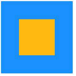
方案二:position绝对定位+transform调整位置
- 适用:子元素未知宽高(当然知道也可以啦!)
- 方法:此方法与方案一是一个道理,将margin换为transform:translate(-50%,-50%)。
.wrapper{
		background: #1890ff;
		height: 400px;
		width:400px;
		position: relative;
	}
.content{
		background: #FFB90F;
		/*width: 200px;*/
		/*height:200px;*/
		position: absolute;
		left: 50%;
		top:50%;
		transform: translate(-50%,-50%);
}
效果:
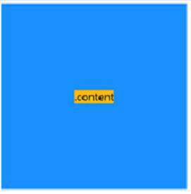
方案三:position绝对定位+margin:auto
- 适用:子元素有宽高尺寸
- 方法:父元素相对定位,子元素绝对定位,left、right、top、bottom设置为0,再用margin:auto。
.wrapper{
		background: #1890ff;
		height: 400px;
		width:400px;
		position: relative;
	}
.content{
		background: #FFB90F;
		width: 200px;
		height:200px;
		position: absolute;
		left: 0;
		right:0;
		top:0;
		bottom:0;
		margin:auto;
}
效果:与方案一相同。
方案四:flex弹性盒
- 适用:子元素未知宽高(当然知道也可以啦!)
- 方法:父元素设置为弹性盒,justify-content和align-items都设置为center居中。
.wrapper{
		background: #1890ff;
		height: 400px;
		width:400px;
		display: flex;
		justify-content: center;/*主轴方向居中*/
		align-items:center;/*侧轴方向居中*/
	}
.content{
		background: #FFB90F;
		/*width: 200px;*/
		/*height:200px;*/
}
效果:与方案二相同。
常见问题FAQ
- 免费下载或者VIP会员专享资源能否直接商用?
- 本站所有资源版权均属于原作者所有,这里所提供资源均只能用于参考学习用,请勿直接商用。若由于商用引起版权纠纷,一切责任均由使用者承担。更多说明请参考 VIP介绍。
- 提示下载完但解压或打开不了?
- 找不到素材资源介绍文章里的示例图片?
- 模板不会安装或需要功能定制以及二次开发?


发表评论
还没有评论,快来抢沙发吧!