
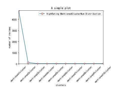
python画分布图代码示例:
# encoding=utf-8
import matplotlib.pyplot as plt
from pylab import *  # 支持中文

mpl.rcParams['font.sans-serif'] = ['SimHei']
# 'mentioned0cluster',
names = ['mentioned1cluster','mentioned2cluster', 'mentioned3cluster', 'mentioned4cluster', 'mentioned5cluster', 'mentioned6cluster', 'mentioned7cluster', 'mentioned8cluster', 'mentioned9cluster', 'mentioned10cluster']
x = range(len(names))
# y_0625 = [39266,56796,42996,24872,13849,8609,5331,1971,554,169,26]

y_0626_1=[4793,100,0,0,0,0,0,0,0,0]
# y_0626_2=[2622,203,0,0,0,0,0,0,0,0,0]

# plt.plot(x, y, 'ro-')
# plt.plot(x, y1, 'bo-')
# pl.xlim(-1, 11) # 限定横轴的范围
# pl.ylim(-1, 110) # 限定纵轴的范围
plt.plot(x, y_0626_1, marker='o', mec='r', mfc='w', label='HighRating:MentionedClusterNum Distribution')
# plt.plot(x, y_0626_2, marker='o', mec='r', mfc='w', label='LowRating:MentionedClusterNum Distribution')
# plt.plot(x, y1, marker='*', ms=10, label=u'y=x^3曲线图')
plt.legend()  # 让图例生效
plt.xticks(x, names, rotation=45)
plt.margins(0)
plt.subplots_adjust(bottom=0.15)
# plt.xlabel(u"time(s)邻居")  # X轴标签
plt.xlabel("clusters")
plt.ylabel("number of reviews")  # Y轴标签
plt.title("A simple plot")  # 标题

plt.show()
效果如下:
python画分布图的思路:
先在列表中定义分布图x、y轴的数值,然后使用plt.plot()方法即可将分布图绘制出来。
更多Python知识请关注Python自学网。
常见问题FAQ
- 免费下载或者VIP会员专享资源能否直接商用?
- 本站所有资源版权均属于原作者所有,这里所提供资源均只能用于参考学习用,请勿直接商用。若由于商用引起版权纠纷,一切责任均由使用者承担。更多说明请参考 VIP介绍。
- 提示下载完但解压或打开不了?
- 找不到素材资源介绍文章里的示例图片?
- 模板不会安装或需要功能定制以及二次开发?


发表评论
还没有评论,快来抢沙发吧!