这是我参与更文挑战的第10天,活动详情查看: 更文挑战
10.1 图片
本文节将学习如何让图片支持响应式行为(这样它们就不会超出父元素的范围)以及如何通过类(class)添加些许样式。
10.1.1 响应式图片
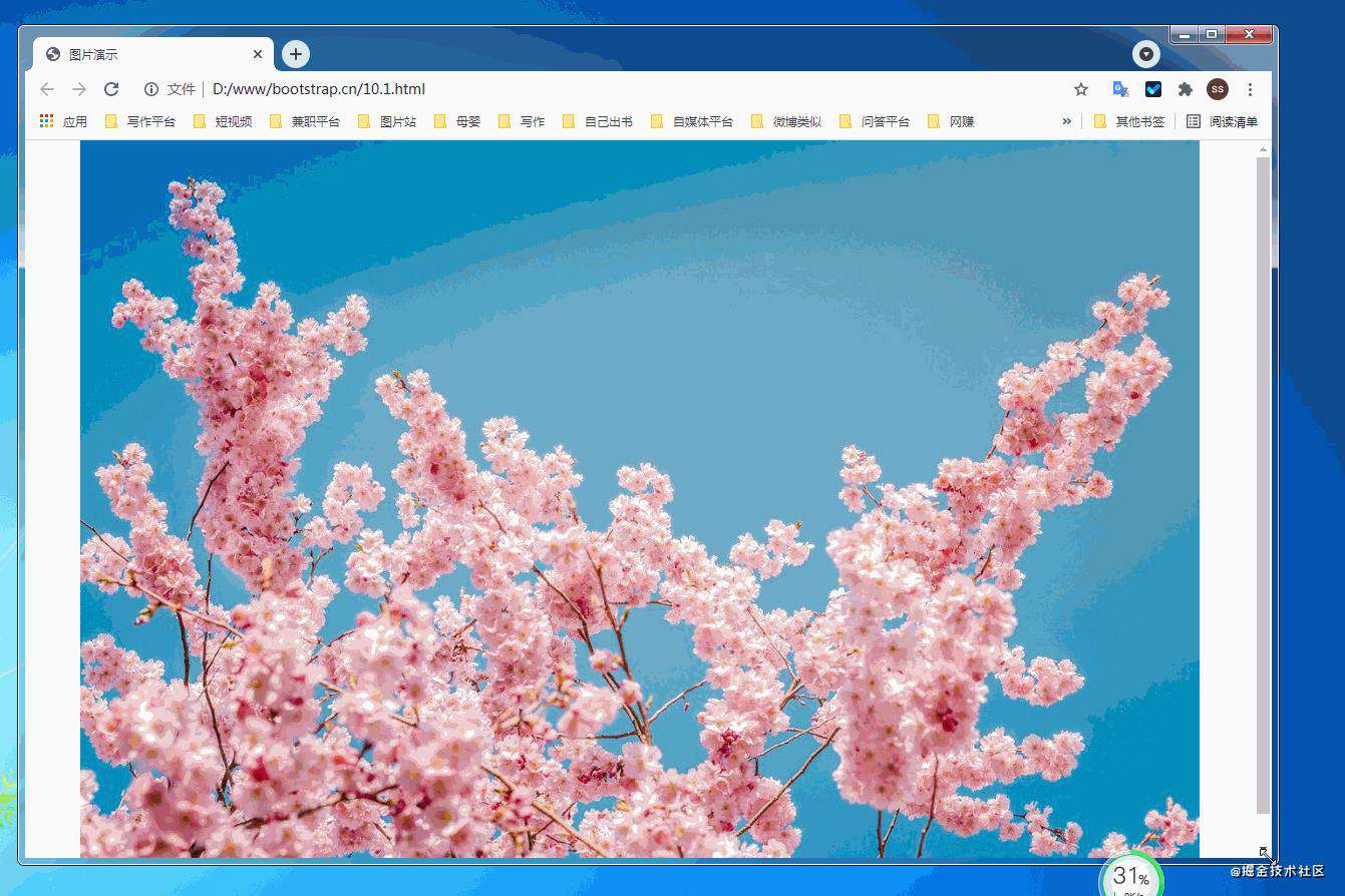
通过 Bootstrap 所提供的.img-fluid 类让图片支持响应式布局。其原理是将max-width: 100%; 和 height: auto; 赋予图片,以便随父元素一起缩放。
<!doctype html>
<html lang="zh-CN">
  <head>
    <meta charset="utf-8">
    <meta name="viewport" content="width=device-width, initial-scale=1">
    <meta name="keywords" content="">
    <meta name="description" content="">
    <link href="bootstrap5/bootstrap.min.css" rel="stylesheet">
    <title>图片演示</title>
  </head>
  <body>
        <div class="container">

            <img src="pic/taohua.jpg" class="img-fluid" >

        </div>

     <script src="bootstrap5/bootstrap.bundle.min.js" ></script>
  </body>
</html>
上面container是为了让图片居中显示切四周有边距,不是图像组件的一部分,下面是演示录像。
10.1.2 图片缩略图
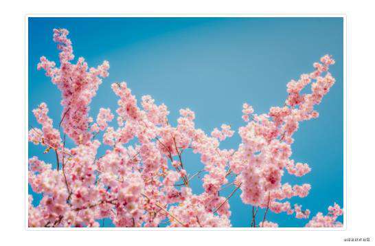
除了通用类提供的提供的border-radius外,你还可以使用.img-thumbnail 使图片的外观具有 1px 宽度的圆形边框。
<!doctype html>
<html lang="zh-CN">
  <head>
    <meta charset="utf-8">
    <meta name="viewport" content="width=device-width, initial-scale=1">
    <meta name="keywords" content="">
    <meta name="description" content="">
    <link href="bootstrap5/bootstrap.min.css" rel="stylesheet">
    <style>
      .div1{width: 300;  height: 300px;text-align: center;padding-top: 50px;}
    </style>
    <title>图片演示</title>
  </head>
  <body>
            <div class="div1">
                 <img src="pic/taohua.jpg"  width="50%" class="img-thumbnail" >
            </div>

     <script src="bootstrap5/bootstrap.bundle.min.js" ></script>
  </body>
</html>
这个组件也是响应式的,不过我只给出了截图,上面css的样式是为了让图片不靠近边上,不要不可能看不到边框,其实直接使用container也一样,在此只是为了不使用container免得大家以为container也是其中一部分。
10.1.3 picture标签
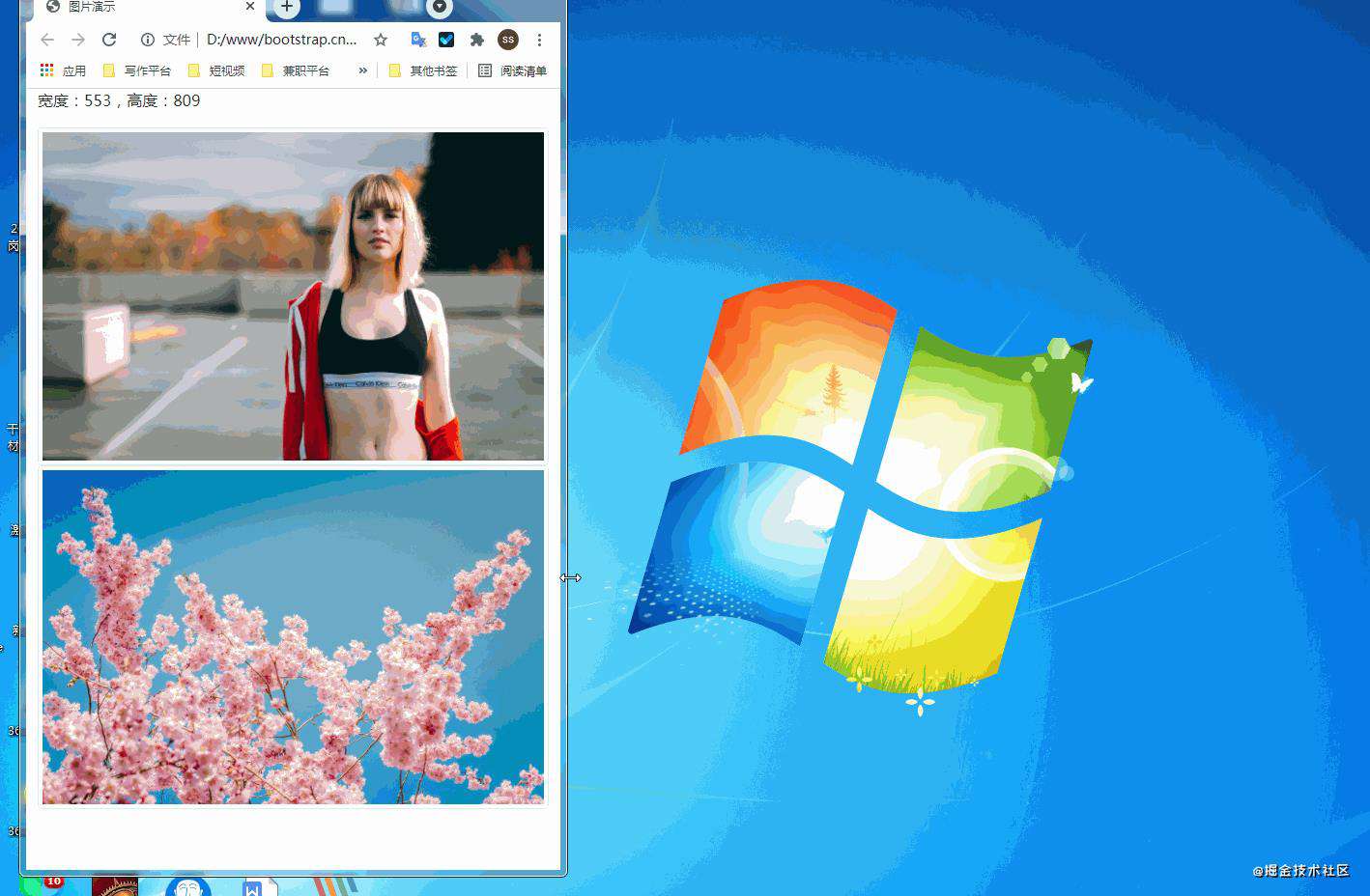
picture元素通过包含一个或多个source元素和一个img元素再结合media(媒体查询)来使用, 根据屏幕匹配的不同尺寸显示不同图片,如果没有匹配到或浏览器不支持 picture 属性则使用 img 元素,一个picture元素无论指定几个source,只会显示其中的一个或者img。
如果你使用 元素为某个 <img> 指定多个 <source> 元素的话,请确保将 .img-* 类添加到 <img> 元素而不是<picture> 元素或者source元素上。
source元素排列是有顺序的。媒体查询的值,如果是max-width,则从小到大排序;如果是min-width,则按从大到小的顺序排列。下面是源码,源码中js代码是获取屏幕宽度,作为对照。
<!doctype html>
<html lang="zh-CN">
  <head>
    <meta charset="utf-8">
    <meta name="viewport" content="width=device-width, initial-scale=1">
    <meta name="keywords" content="">
    <meta name="description" content="">
    <link href="bootstrap5/bootstrap.min.css" rel="stylesheet">
    <title>图片演示</title>
  </head>
  <body>
        <div class="container">
            <p>
                <span id="info"></span>
                <script>
                getwidth();
                window.onresize = function(){
                    getwidth();
                }
                function getwidth(){
                document.getElementById("info").innerHTML="宽度:"+document.documentElement.clientWidth+",高度:"+document.documentElement.clientHeight;
                }
                </script>
                    </p>
            <picture>
                <source media="(max-width: 600px)" srcset="pic/girl1.jpg">
                <source media="(max-width: 700px)" srcset="pic/girl2.jpg">
                <img src="pic/taohua.jpg" class="img-thumbnail">
            </picture>

            <picture>
                <source media="(min-width: 700px)" srcset="pic/girl1.jpg">
                <source media="(min-width: 600px)" srcset="pic/girl2.jpg">
                <img src="pic/taohua.jpg" class="img-thumbnail">
            </picture>
        </div>

     <script src="bootstrap5/bootstrap.bundle.min.js" ></script>
  </body>
</html>
下面是演示
10.2 轮廓(Figures)
通过 Bootstrap 的轮廓(figure)组件来显示相关联的图片和文本。任何时候需要显示一段内容(例如带有可选标题的图片),请使用 <figure>标签。
使用内置的.figure、.figure-img和.figure-caption类别,可提供HTML5 <figure>和<figcaption>标签一些基本样式设定。图片没有明确尺寸,请务必在<img>标签加上 .img-fluid类别设定为响应式图片。
事实上,轮廓组件不仅用于图片,在前一节文字排版部分,引用来源部分就已经使用了轮廓组件。
<!doctype html>
<html lang="zh-CN">
  <head>
    <meta charset="utf-8">
    <meta name="viewport" content="width=device-width, initial-scale=1">
    <meta name="keywords" content="">
    <meta name="description" content="">
    <link href="bootstrap5/bootstrap.min.css" rel="stylesheet">
    <title>figure演示</title>
  </head>
  <body>
        <div class="container">

            <figure class="figure">
                <img src="pic/taohua.jpg" class="figure-img img-fluid rounded" >
                <figcaption class="figure-caption text-center">桃花朵朵开</figcaption>
                </figure>
        </div>

     <script src="bootstrap5/bootstrap.bundle.min.js" ></script>
  </body>
</html>
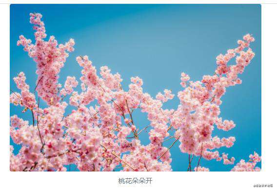
简单解释一下img标签里面的类rounded是图片四周为圆角,不需要可以不写。 figcaption标签里面的类text-center是图片居中对齐,还可以用text-end为右对齐,默认可以不写为左对齐。
今天的课程就到这里。请关注我,及时学习 俺老刘原创的《Bootstrap5零基础到精通》第11节 Bootstrap中的表格,表格的用处非常广泛,设计起来也比较麻烦,幸运的是借助bootstrap我们可以很轻松地做出好看的表格。
如果这篇文章对你有帮助,记得随手点赞哦!
常见问题FAQ
- 免费下载或者VIP会员专享资源能否直接商用?
- 本站所有资源版权均属于原作者所有,这里所提供资源均只能用于参考学习用,请勿直接商用。若由于商用引起版权纠纷,一切责任均由使用者承担。更多说明请参考 VIP介绍。
- 提示下载完但解压或打开不了?
- 找不到素材资源介绍文章里的示例图片?
- 模板不会安装或需要功能定制以及二次开发?


发表评论
还没有评论,快来抢沙发吧!