1. 对于包含块的理解?
一个元素的尺寸和位置经常受其包含块containint block的影响。大多数情况下,包含块就是这个元素最近的祖先块元素的内容区,但也不是总是这样。
2. 包含块的影响
在学习如何确定元素包含块之前,先了解一下它的重要性。
元素的尺寸及位置,常常会受它的包含块所影响。对于一些属性,例如 width, height, padding, margin,绝对定位元素的偏移值 (比如 position 被设置为 absolute 或 fixed),当我们对其赋予百分比值时,这些值的计算值,就是通过元素的包含块计算得来。
3. 确定包含块
确定一个元素的包含块的过程完全依赖于这个元素的 position 属性:
-
如果 position 属性为
static、relative或sticky,包含块可能由它的最近的祖先块元素(比如说inline-block, block 或 list-item元素)的内容区的边缘组成,也可能会建立格式化上下文(比如说 a table container, flex container, grid container, 或者是 the block container 自身)。 -
如果 position 属性为
absolute,包含块就是由它的最近的 position 的值不是static(也就是值为fixed,absolute,relative或sticky)的祖先元素的内边距区的边缘组成。 -
如果 position 属性是
fixed,在连续媒体的情况下(continuous media)包含块是 viewport ,在分页媒体(paged media)下的情况下包含块是分页区域(page area)。 -
如果 position 属性是absolute或fixed,包含块也可能是由满足以下条件的最近父级元素的内边距区的边缘组成的:
-
transform或perspective的值不是none -
will-change的值是transform或perspective -
filter的值不是none或will-change的值是filter(只在 Firefox 下生效). -
contain的值是paint(例如:contain: paint;)
-
原文:
The process for identifying the containing block depends entirely on the value of the element's position property:
-
If the
positionproperty is**static**,**relative**, orsticky, the containing block is formed by the edge of thecontent box
of the nearest ancestor element that is either a block container (such as an inline-block, block, or list-item element) or establishes a formatting context (such as a table container, flex container, grid container, or the block container itself).
-
If the
positionproperty is**absolute**, the containing block is formed by the edge of thepadding box
of the nearest ancestor element that has a
positionvalue other thanstatic(fixed,absolute,relative, orsticky). -
If the
positionproperty is**fixed**, the containing block is established by the viewport (in the case of continuous media) or the page area (in the case of paged media). -
If the
positionproperty is**absolute**or**fixed**, the containing block may also be formed by the edge of thepadding box
of the nearest ancestor element that has the following:
-
A
transformorperspectivevalue other thannone -
A
will-changevalue oftransformorperspective -
A
filtervalue other thannoneor awill-changevalue offilter(only works on Firefox). -
A
containvalue ofpaint(e.g.contain: paint;)
-
Note: The containing block in which the root element (<html>) resides is a rectangle called the initial containing block. It has the dimensions of the viewport (for continuous media) or the page area (for paged media).
浏览器视口(viewport)
通过js代码获取视口大小:
function getClientSize() {
    var w=window.innerWidth || document.documentElement.clientWidth || document.body.clientWidth;
    var h=window.innerHeight || document.documentElement.clientHeight || document.body.clientHeight;
    return {w, h}
}
4. position值为static、relative、sticky时宽高百分比的计算
If the position property is static, relative, or sticky, the containing block is formed by the edge of the content box of the nearest ancestor element that is either a block container (such as an inline-block, block, or list-item element) or establishes a formatting context (such as a table container, flex container, grid container, or the block container itself).
<style>
* {
margin: 0;
}
.inner {
/* position默认值为static,这个例子中static、relative、sticky取得的结果是一致的 */
position: static;
height: 10%;
width: 20%;
background-color: blue;
}
</style>
<body>
<div class="inner"></div>
</body>
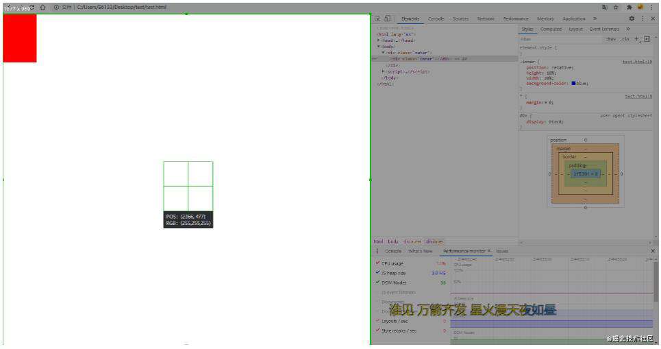
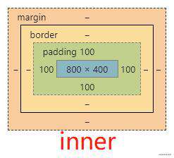
可以发现inner的宽为215.391,高为0,页面显示空白。
距离inner最近的块级元素为body元素,因此body的内容区content box就是inner的包含块。**在无边距的情况下,无内容的块级元素高度为0且默认占满一行,一般来说一行的宽度相当于视口的宽度,因此body宽度=视口viewport的宽度。**通过getClientSize获取视口宽高 {w: 1077, h: 969},也就是说,包含块body的content box宽高{w: 1077, h: 0},因此inner宽高{w: 1077/5=215.4, h: 0}。
可以试着给body一个100px的高,发现inner的高度变为10px。
需要注意的是,一定是要以最近的块级元素的内容区content box作为包含块。
<body>
<div class="outer">
<div class="inner"></div>
</div>
</body>
<style>
* {
margin: 0;
}
body {
height: 200px;
padding: 100px;
}
.outer {
height: 400px;
width: 400px;
background-color: red;
display: inline;
}
.inner {
height: 10%;
width: 20%;
background-color: blue;
}
</style>
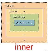
此时的父元素outer是行内元素,所以依然是以最近的块级元素的内容区content box为准。
视口宽高依然是 {w: 1077, h: 969}
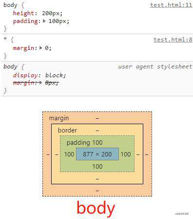
此时body元素的内容区content box:高度为固定的200px,而宽度需要视口宽度(块级元素默认是占满一行的)减去左右内边距总和200px,因此body{w: 1077-200=877, h: 200},即inner{w: 877/5=175.4, h: 20}。
5. position值为absolute时宽高百分比的计算
If the position property is absolute, the containing block is formed by the edge of the padding box of the nearest ancestor element that has a position value other than static (fixed, absolute, relative, or sticky).
<body>
<div class="outer">
<div class="inner"></div>
</div>
</body>
<style>
* {
margin: 0;
}
.outer {
position: relative; /* 这个例子中relative、sticky、fixed、absolute取得的结果是一致的 */
height: 400px;
width: 400px;
background-color: red;
}
.inner {
position: absolute;
height: 10%;
width: 20%;
background-color: blue;
}
</style>
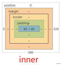
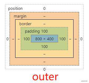
距离inner最近的position不为static的祖先元素是outer{w: 400, h: 400},无padding,即inner的包含块为outer的content+padding,即{w: 400, h: 400},因此inner{w: 80, h: 40}
尝试给outer加上padding: 100px试试。
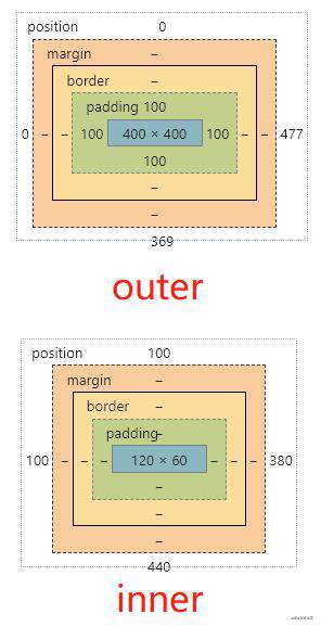
此时的outer宽高为{w: 400+200, h: 400+200},因此inner的包含块宽高也发生了改变,为outer的content+padding,即{w: 600, h: 600}。
在上面的基础上,将outer的position改成static。
.outer {
    position: static;  /* 改成默认值 */
    height: 400px;
    width: 400px;
    background-color: red;
    padding: 100px;
}
.inner {
    position: absolute;
    height: 10%;
    width: 20%;
    background-color: blue;
}
此时的inner:
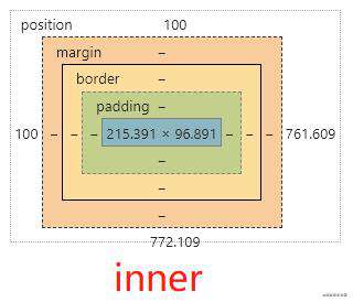
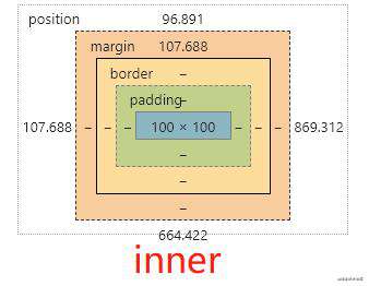
此时,inner的最近的postion不为static的祖先元素既不是outer也不是body,那么只剩下html了,即,inner此时的包含块为初始包含块,通过getClientSize得知initial containing block的大小为{w: 1077, h: 969},因此inner{w: 1077/5=215.4, h: 969/10=96.9}。
6. position值为fixed时宽高百分比的计算
If the position property is fixed, the containing block is established by the viewport (in the case of continuous media) or the page area (in the case of paged media).
<body>
<div class="outer">
<div class="inner"></div>
</div>
</body>
<style>
* {
margin: 0;
}
.outer {
position: relative;
height: 400px;
width: 400px;
background-color: red;
padding: 100px;
}
.inner {
position: fixed;
height: 10%;
width: 20%;
background-color: blue;
}
</style>
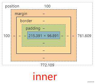
此时inner的大小和上一张图的大小一样,都是根据初始包含块为基准进行计算的:
7. position值为static、relative、sticky时边距百分比的计算
边距的计算都是以包含块的宽度为参考来计算的。
当position的值为static、relative、sticky时,是以最近块级祖先的content box为包含块计算的
<body>
<div class="outer">
<div class="inner"></div>
</div>
</body>
<style>
* {
margin: 0;
}
.outer {
height: 400px;
width: 800px;
background-color: red;
padding: 100px; /* 此时的padding不参与计算,加不加的结果是一样的 */
}
.inner {
position: static; /* 这个例子中static、relative、sticky取得的结果是一致的 */
margin-top: 10%;
height: 100px;
width: 100px;
background-color: blue;
}
</style>
此时inner的margin-top的值计算出来是80px:
当position的值为absolute时,是以最近position值不为static的祖先元素的padding box计算的
例①:将inner的position改成absolute:
<style>
     * {
         margin: 0;
     }
     .outer {
         height: 400px;
         width: 800px;
         background-color: red;
         padding: 100px;
     }
     .inner {
         position: absolute;
         margin-top: 10%;
         height: 100px;
         width: 100px;
         background-color: blue;
     }
</style>
此时inner的包含块是初始包含块,因此inner的margin-top的值1077/10=107.7。
例②:在例①的基础上将outer的position值由默认的static改为relative(非static得所有值,结果都是一样的):
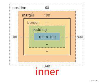
此时,outer元素的padding box就是inner元素的包含块,因此inner的margin-top最终值为:(800(width)+100(padding-left)+100(padding-right)) * 10% = 100。
当position的值为fixed时,是以初始包含块为参考来计算的
将inner的position改成fixed,此时inner的包含块是初始包含块,因此inner的margin-top的值1077/10=107.7。
8. 定位元素的offset值为百分比的计算方式
定位元素的top、bottom、left、right是以最近的postion值不为static的祖先元素的padding box作为包含块计算的。
<style>
    * {
        margin: 0;
    }
    .outer {
        height: 400px;
        width: 800px;
        background-color: red;
        padding: 100px;
    }
    .inner {
        position: absolute;
        top: 10%;
        left: 10%;
        margin-top: 10%;
        height: 100px;
        width: 100px;
        background-color: rgb(106, 106, 129);
    }
</style>
此时inner的包含块是初始包含块。
在此基础上试试给outer加上postion:relative:
9. 总结
日常开发中,除去特殊情况,我们可以按下列规则来记:
-
position为relative、static、sticky的元素,其包含块是最近块级祖先元素的content box,计算百分比宽高时是以包含块的content box为参考,计算百分比边距是以包含块的宽度为参考计算的。
-
position为absolute的元素,其包含块是最近的position值不为static的祖先元素的padding box(如果没有,则包含块为初始包含块),计算百分比宽高时是以包含块的padding box为参考,计算百分比边距是以包含块的宽度为参考计算的,计算offset值,是以padding box为参考计算的。
-
position为fixed的元素,其包含块是初始包含块。
参考
- developer.mozilla.org/en-US/docs/… MDN
常见问题FAQ
- 免费下载或者VIP会员专享资源能否直接商用?
- 本站所有资源版权均属于原作者所有,这里所提供资源均只能用于参考学习用,请勿直接商用。若由于商用引起版权纠纷,一切责任均由使用者承担。更多说明请参考 VIP介绍。
- 提示下载完但解压或打开不了?
- 找不到素材资源介绍文章里的示例图片?
- 模板不会安装或需要功能定制以及二次开发?


发表评论
还没有评论,快来抢沙发吧!